We Dnie W Nocy

Brand identity and logo design for We Dnie W Nocy, a bistro and bar. A chalice-and-hands symbol connects the rituals of nightlife with references to sacred imagery.
Client
We Dnie W Nocy
Year
2024
Category
Brand Identity
Identyfikacja wizualna We Dnie W Nocy — logo winebaru z kielichem w łuku kaplicy na tle ceglanej ściany. Branding dla gastronomii Wrocław, studio graficzne Recreate
Research
The concept explores the contrast between day and night, spirituality and contemporary nightlife. Sacral architecture, liturgical symbols and the idea of ritual informed the direction. These references became a framework for the venue's visual identity rather than a conventional hospitality aesthetic.
Design
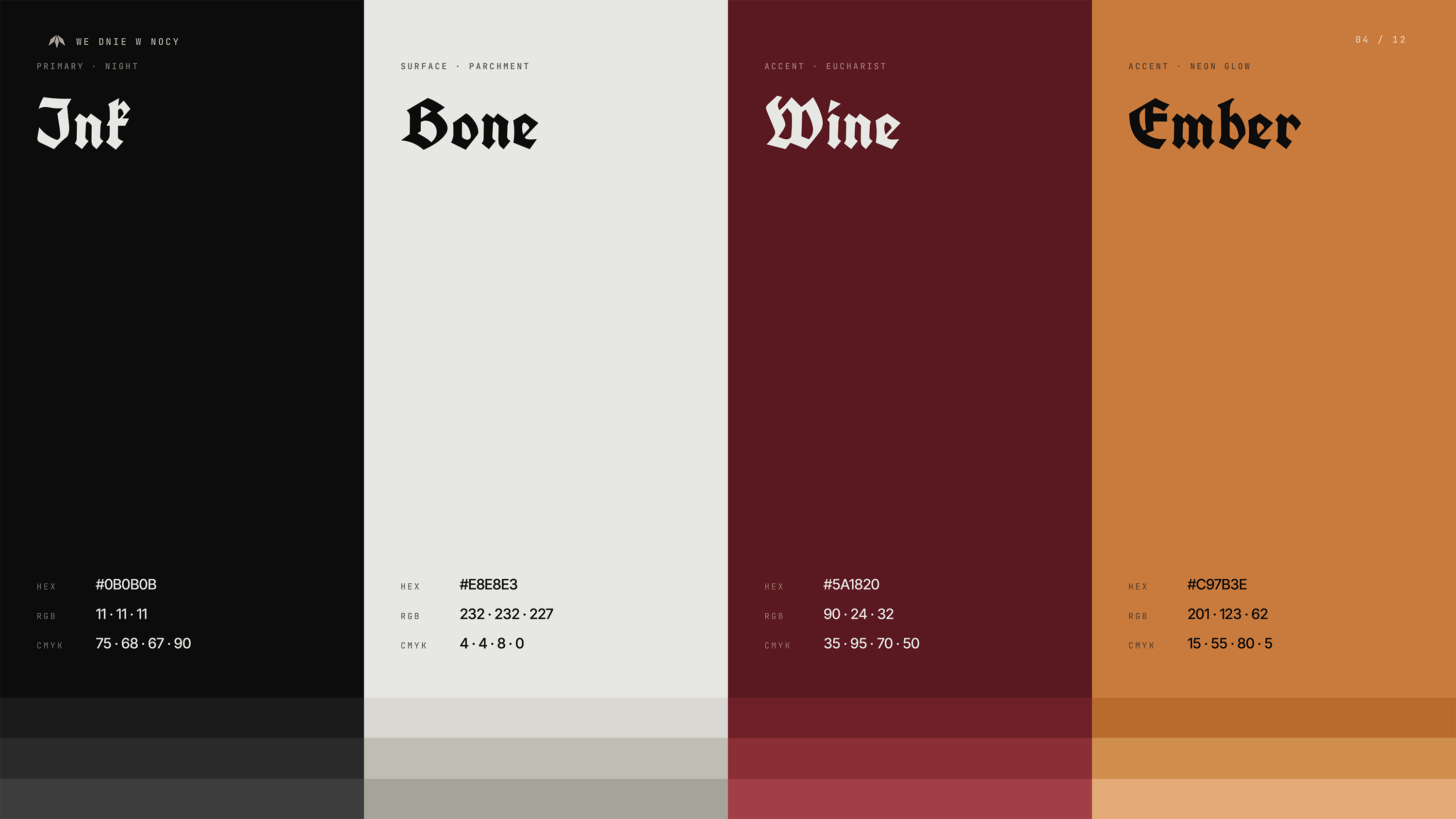
The logo draws on stained-glass geometry, bringing a chalice and a pair of hands into one symbol. SchwarzKopf Old blackletter typography is paired with a restrained grotesque for contrast and readability. Black, ivory and warm gold support a graphic language built around symbolism and repetition.
Development
The identity extends across menus, signage, merchandise, social media and environmental applications. Neon versions of the mark bring the graphic concept into the venue. Materials and textures connect these applications, carrying the same visual language from printed communication into physical space.
Next Project
MnaGotowo