Design
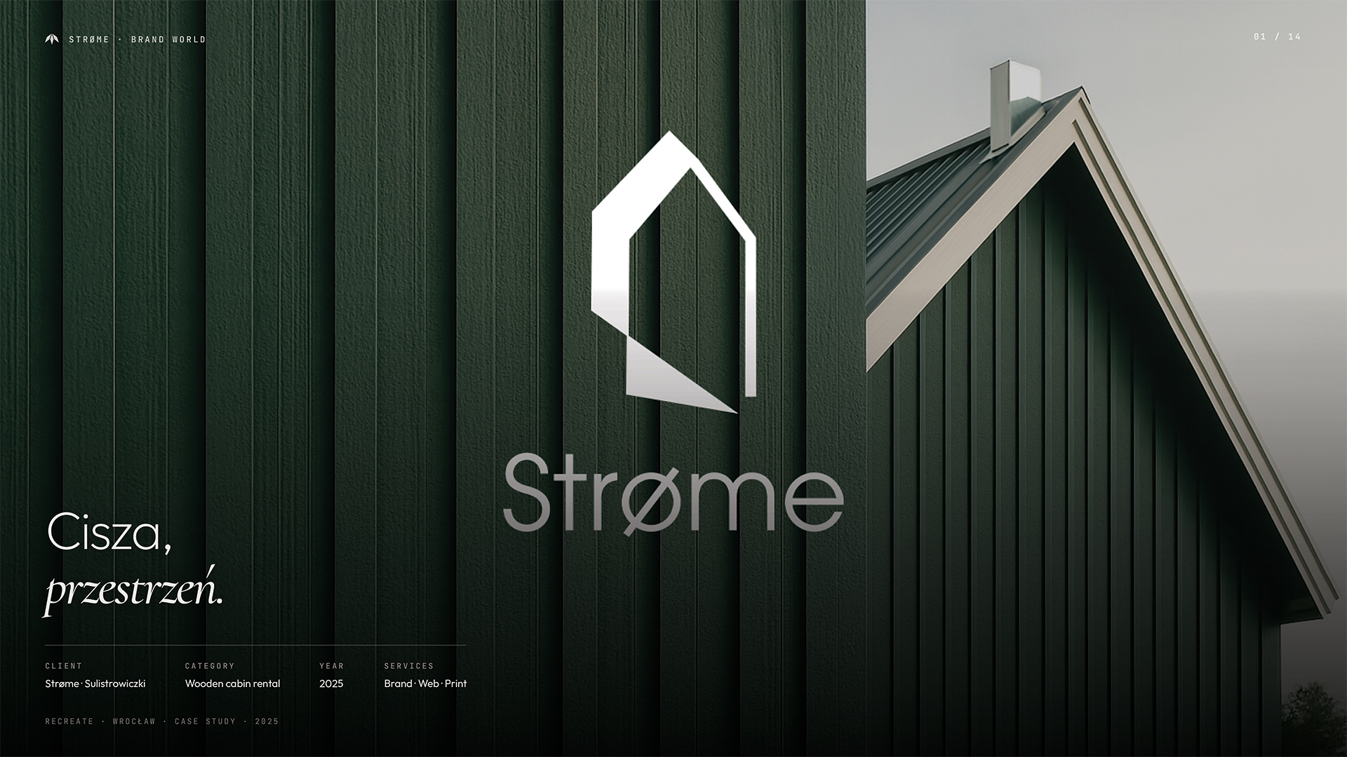
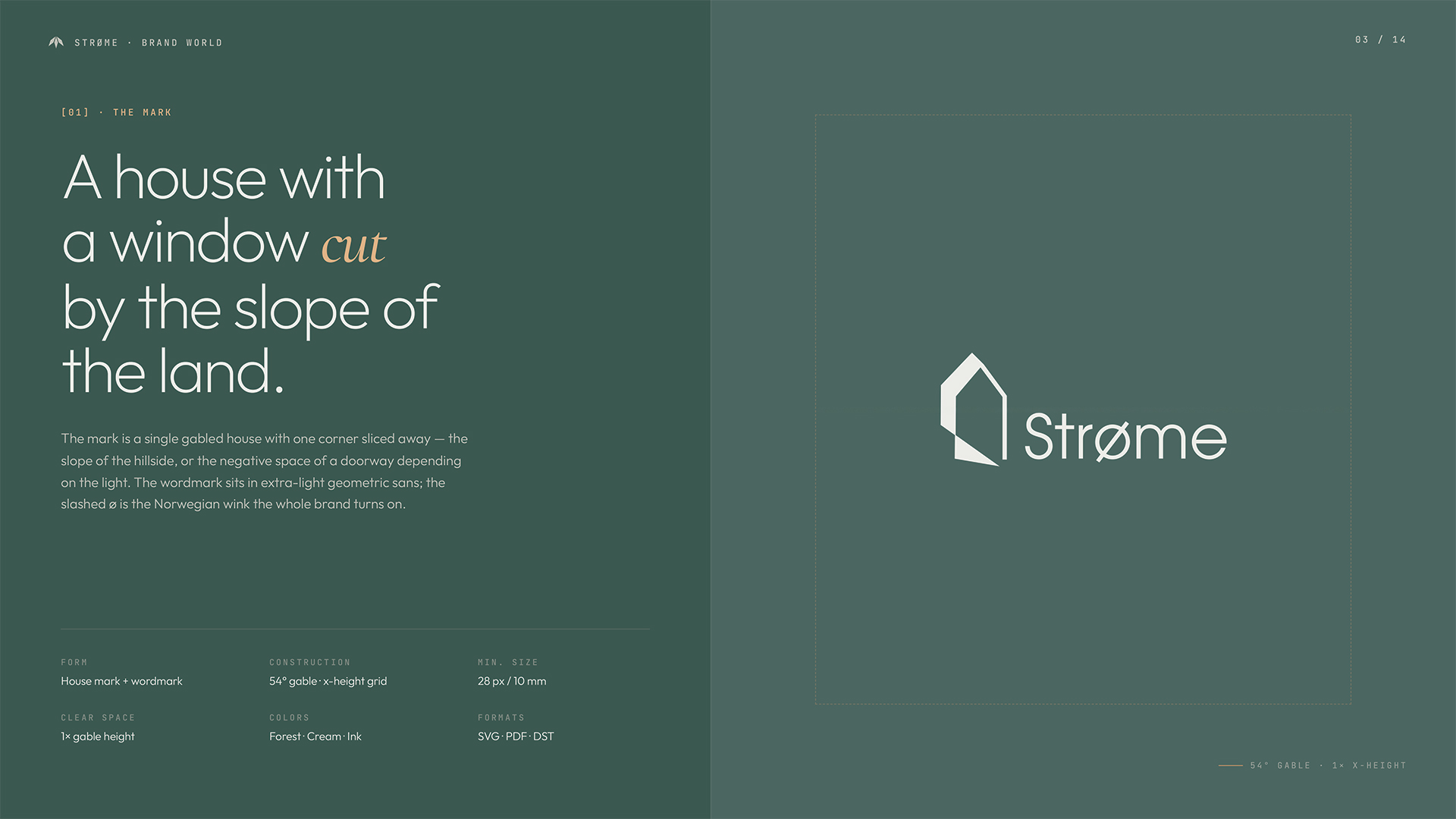
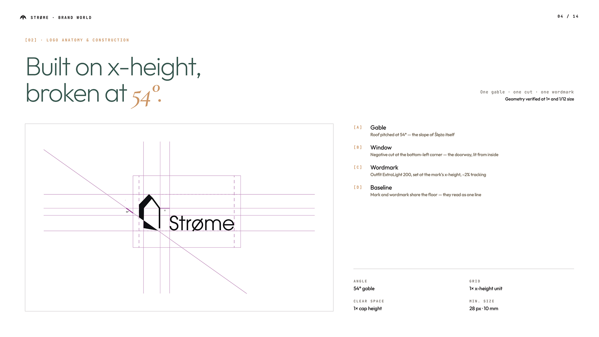
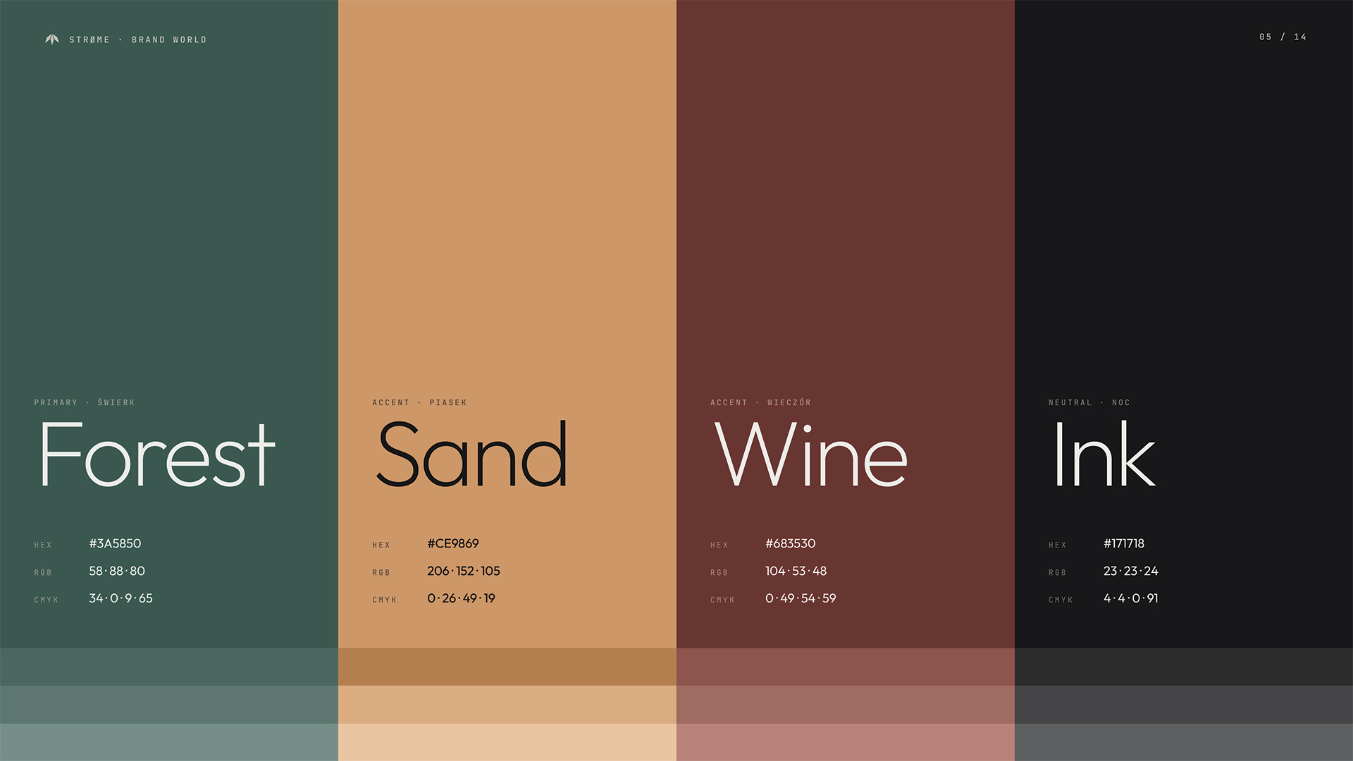
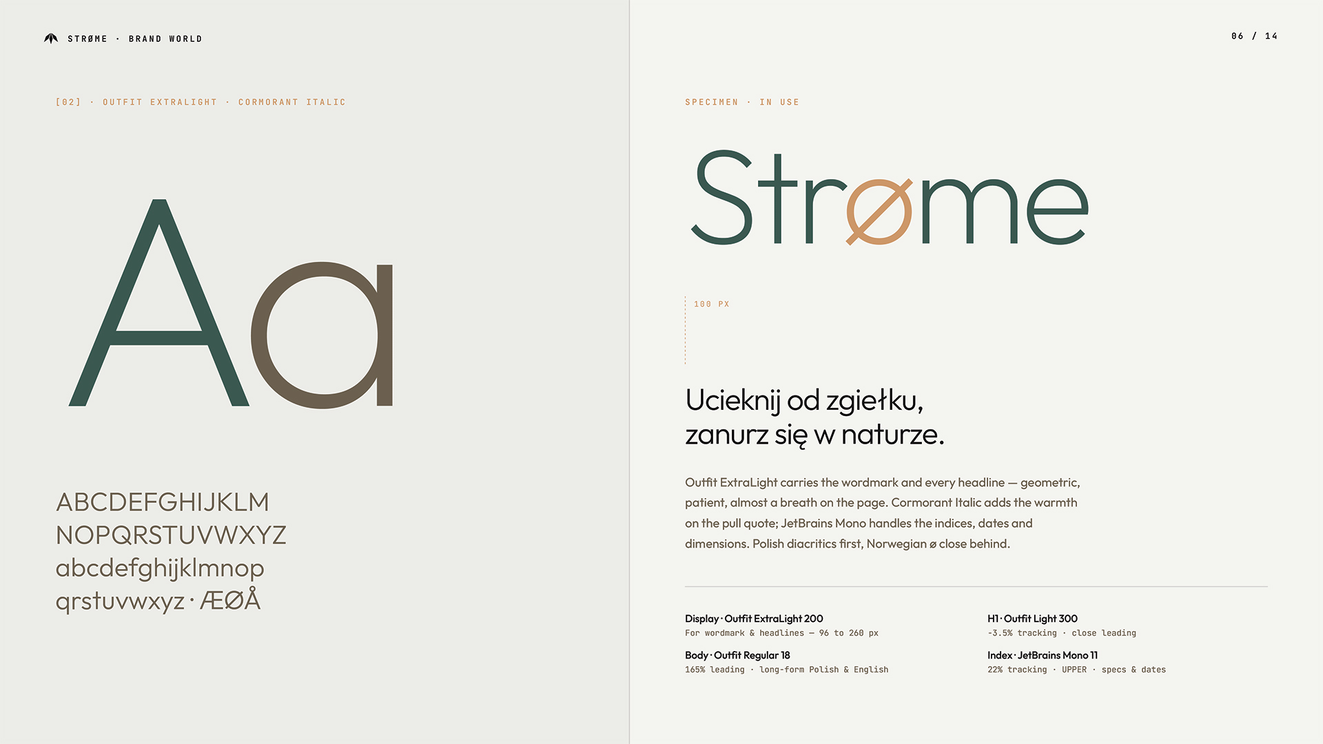
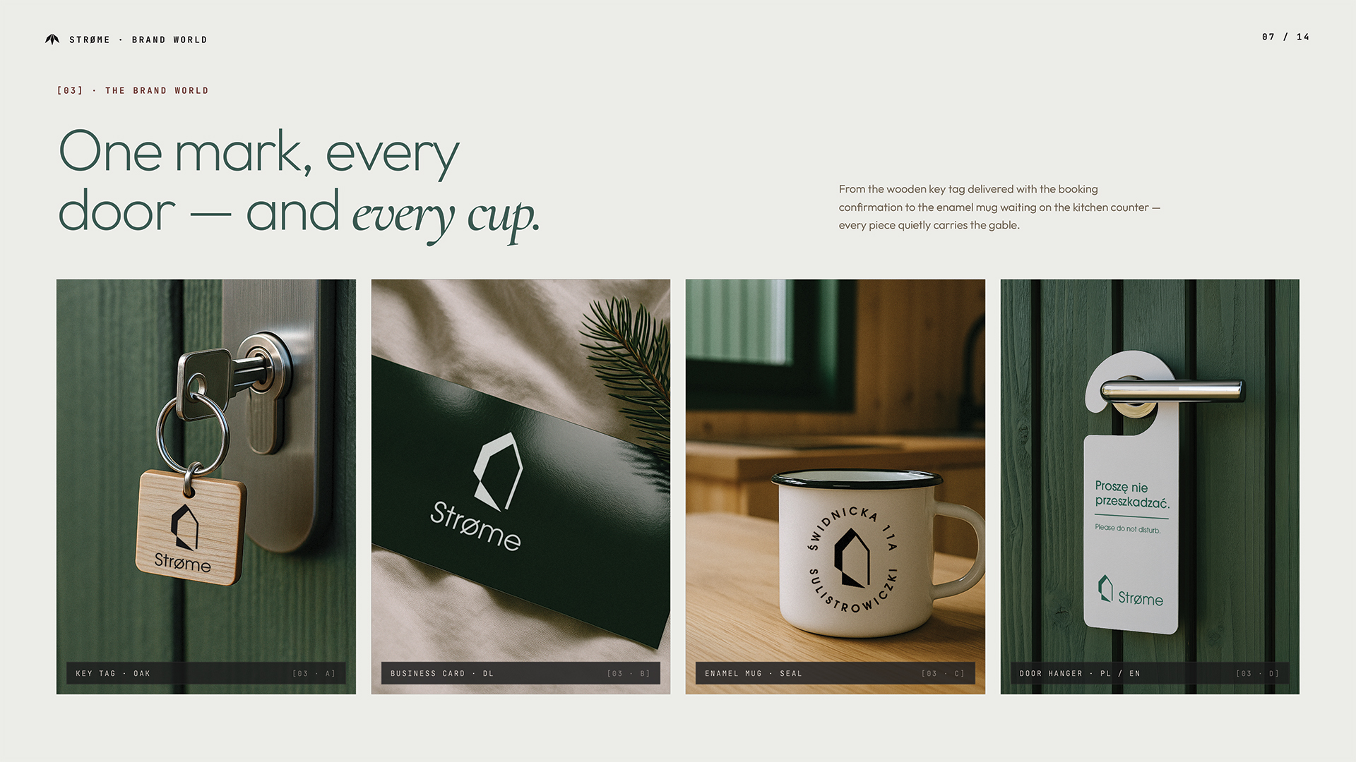
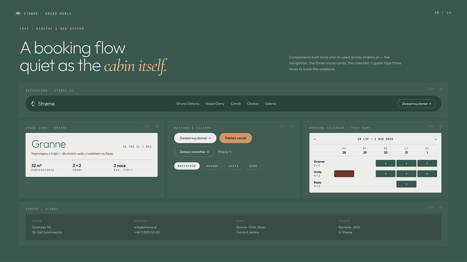
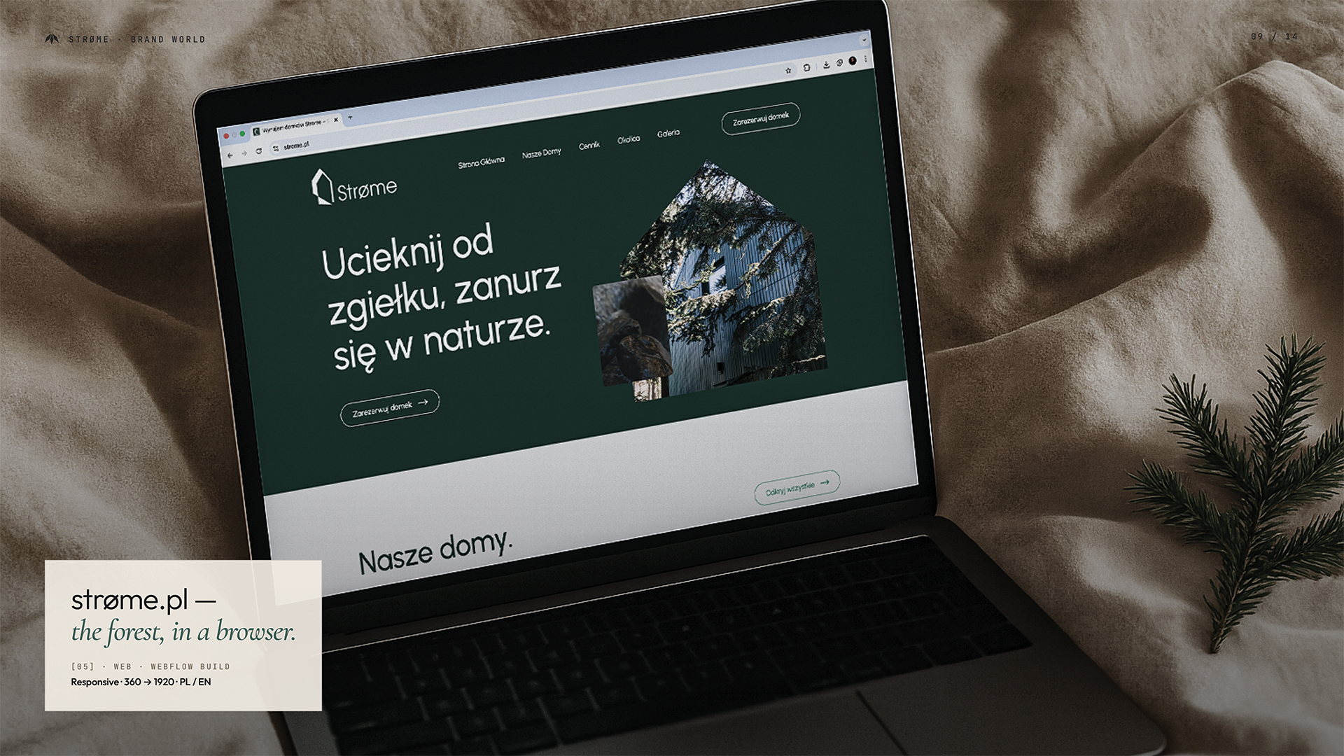
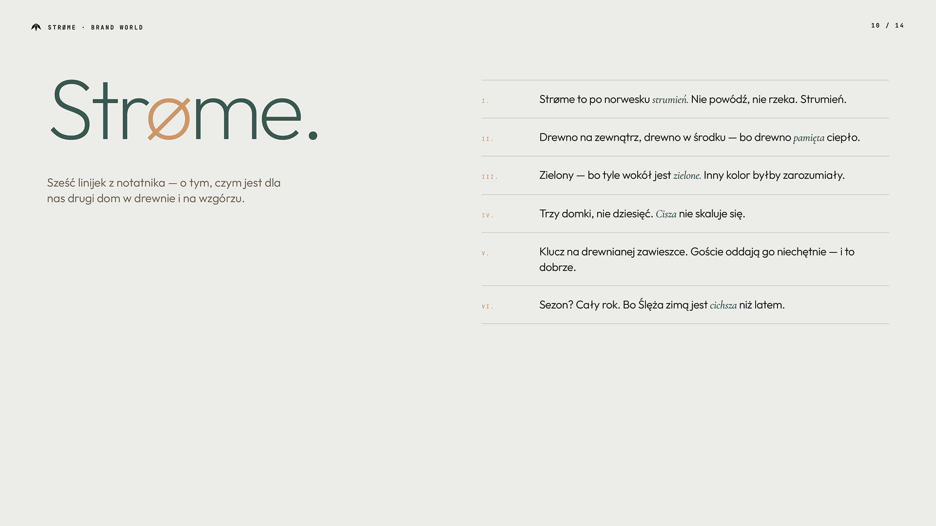
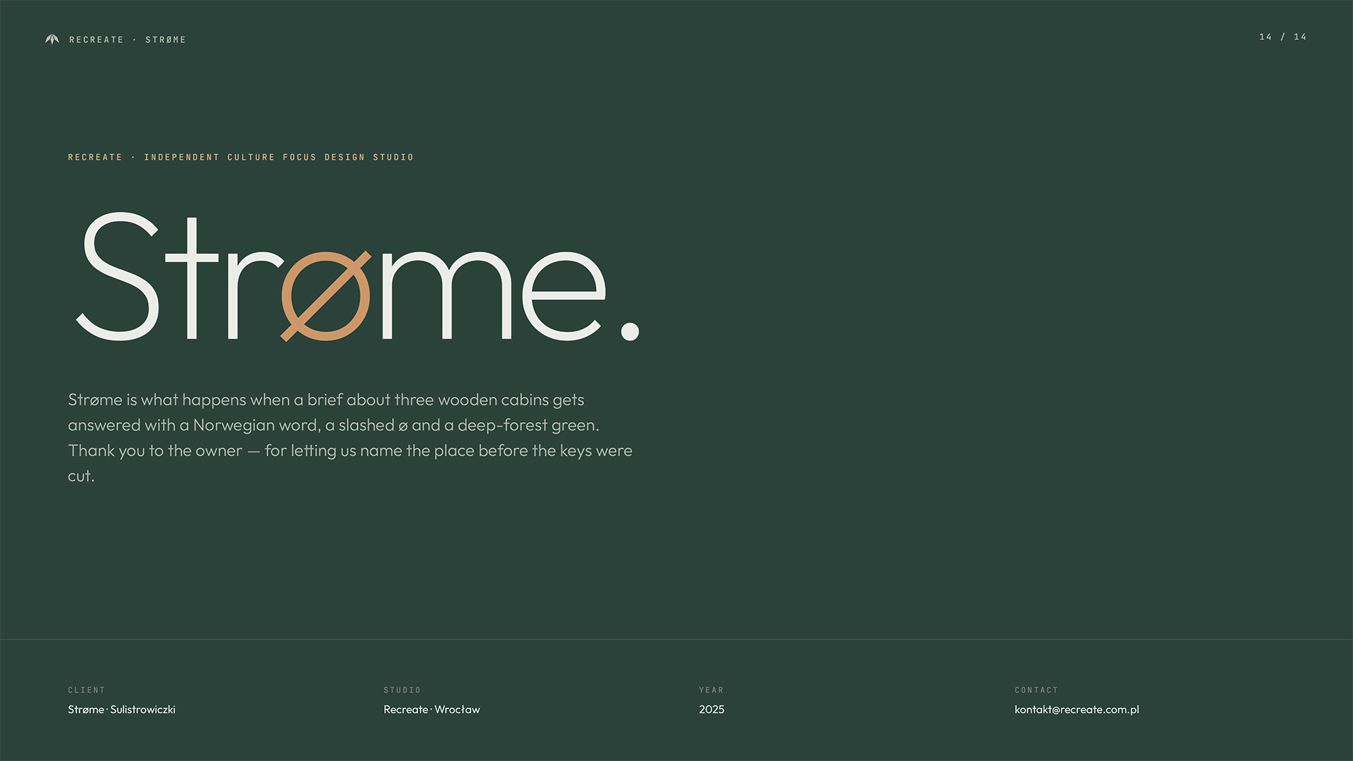
We created a full visual identity built around the idea of flow—both in nature and in the guest experience. The logotype uses the Norwegian ø as a subtle nod to its Scandinavian inspiration, paired with a geometric icon that evokes shelter and openness at once. The color palette draws directly from the site: deep greens, natural textures, and soft neutrals. Every brand element, from printed materials to signage and wayfinding, was designed to feel integrated with the cabins and their surroundings—calm, quiet, but unmistakable.