Smagala Strzelczyk

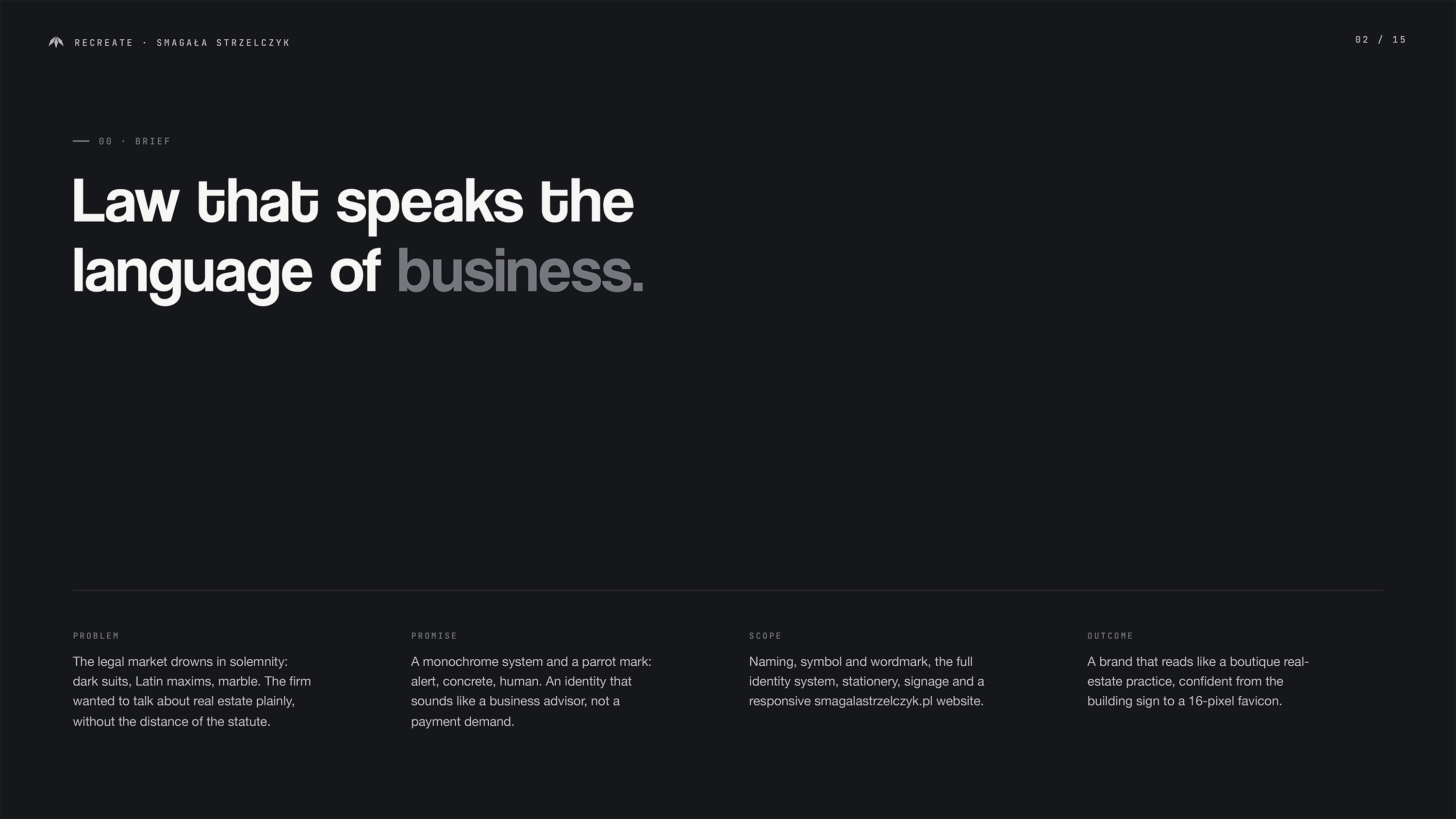
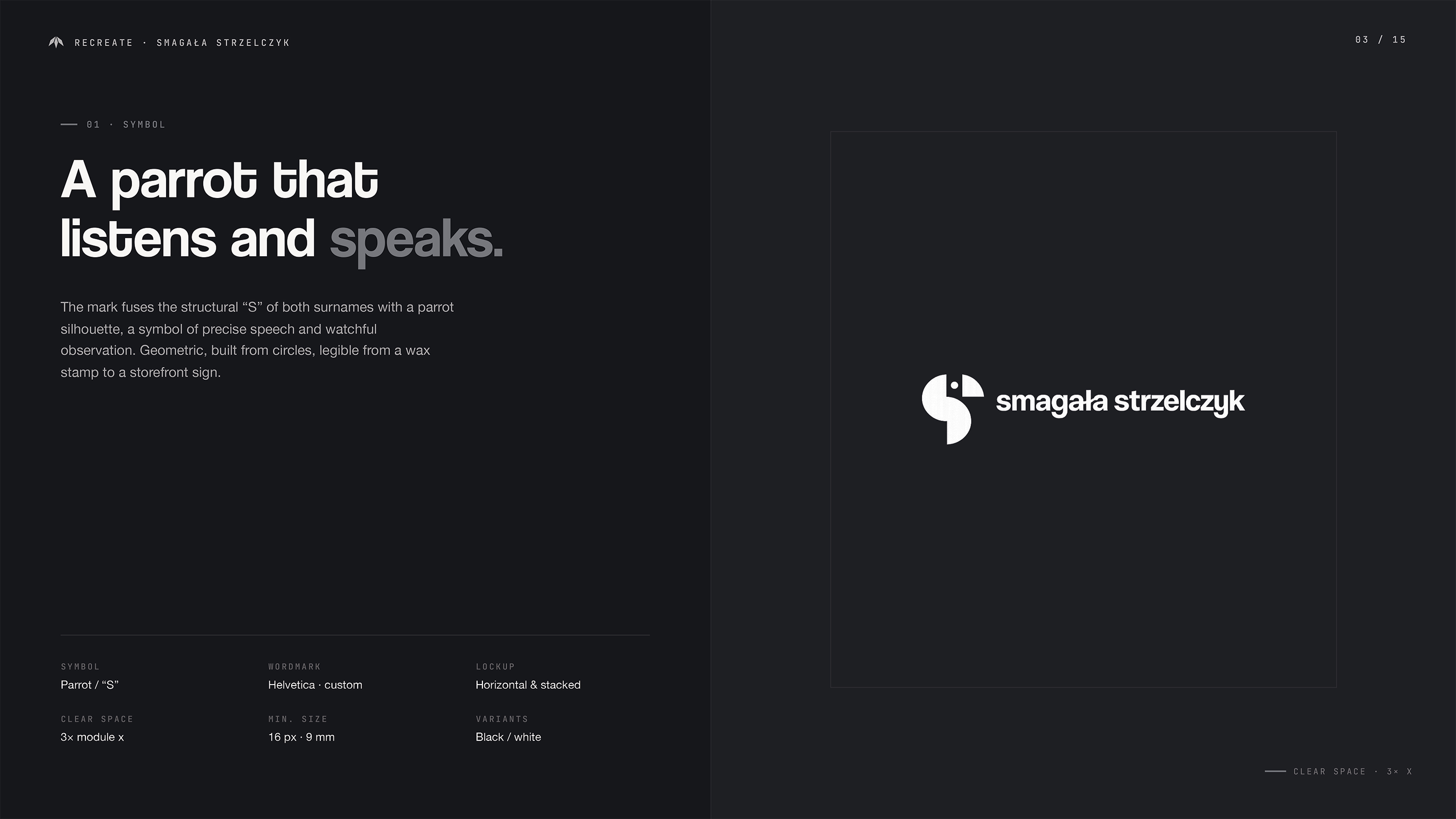
Brand identity and website design for Smagała Strzelczyk, a law firm in Wrocław. A geometric parrot symbol gives the practice a distinctive presence across documents, signage and digital communication.
Client
Smagała Strzelczyk
Year
2026
Category
Brand Identity & Web Design
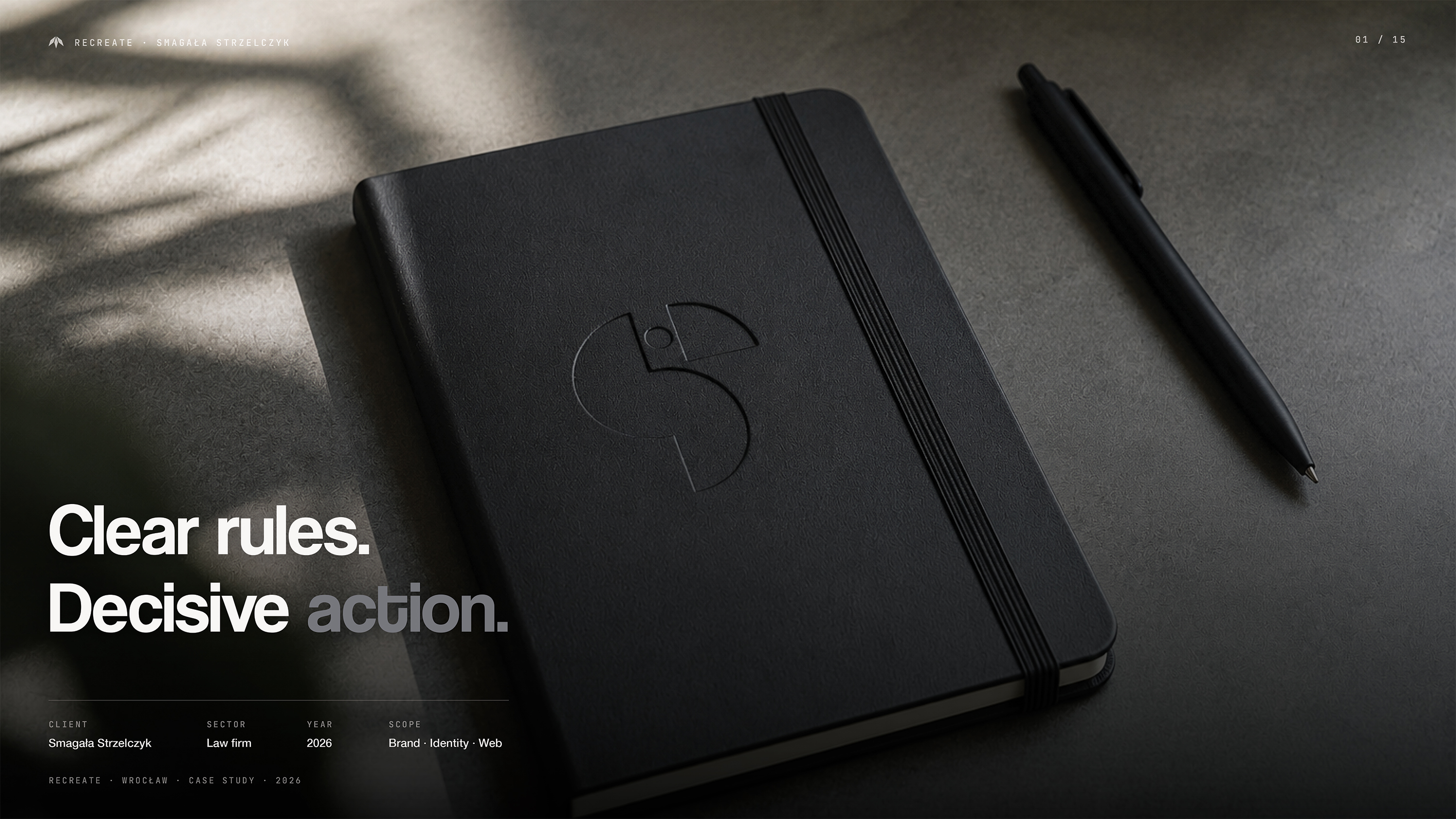
Slide okładkowy case study Smagała Strzelczyk — czarny notes z wytłoczonym logo kancelarii (sylwetka papugi jako litera S) leży obok czarnego długopisu na ciemnym blacie; hasło Clear rules. Decisive action.
Research
We examined the visual language of legal services to find a recognisable direction beyond conventional legal symbols. The Polish association between a parrot and a lawyer became the starting point. It offered a way to connect precision of speech with a simple graphic idea.
Design
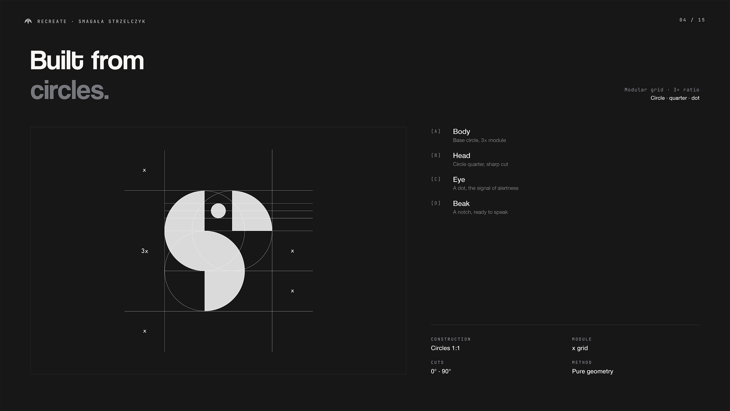
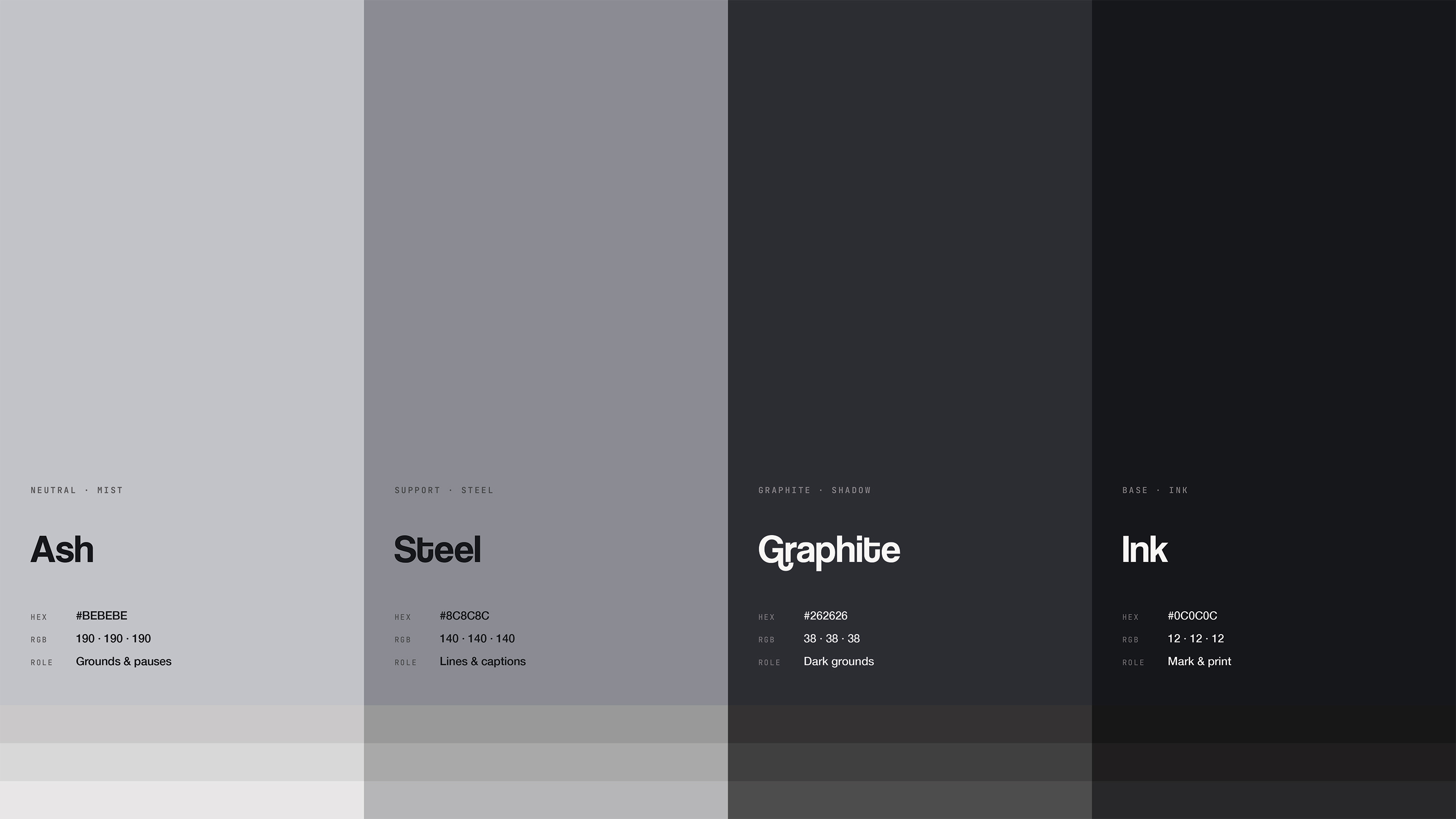
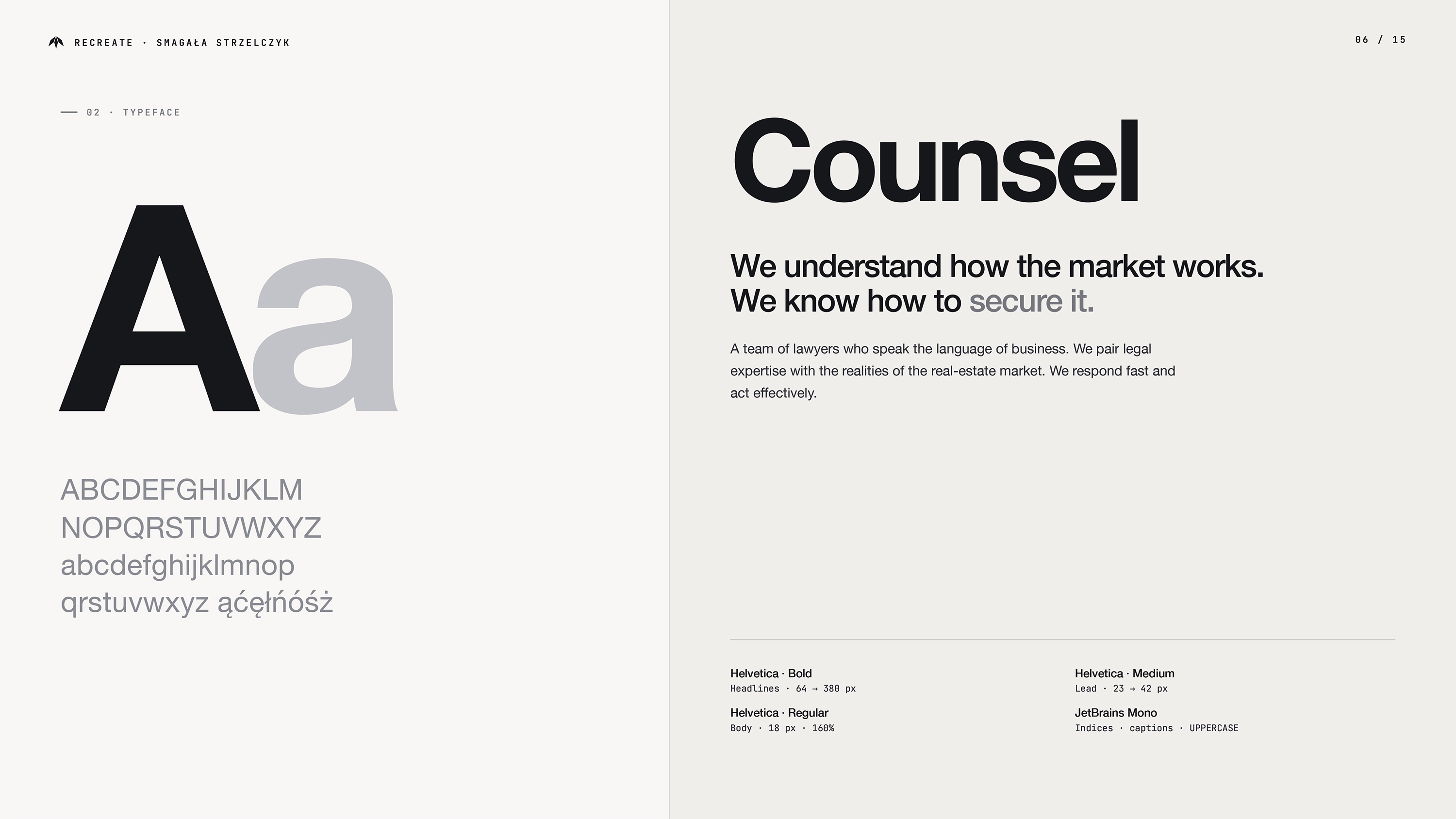
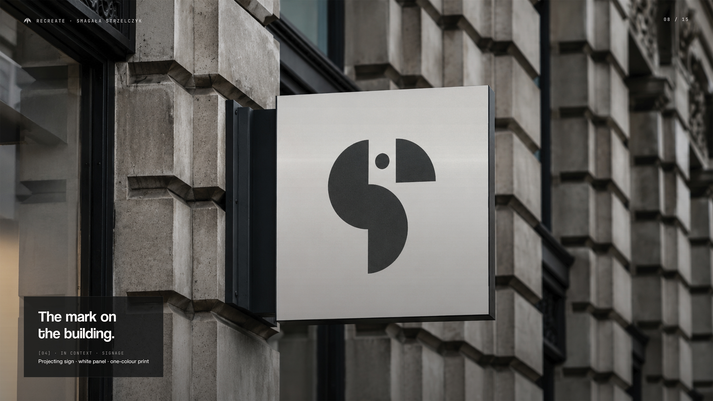
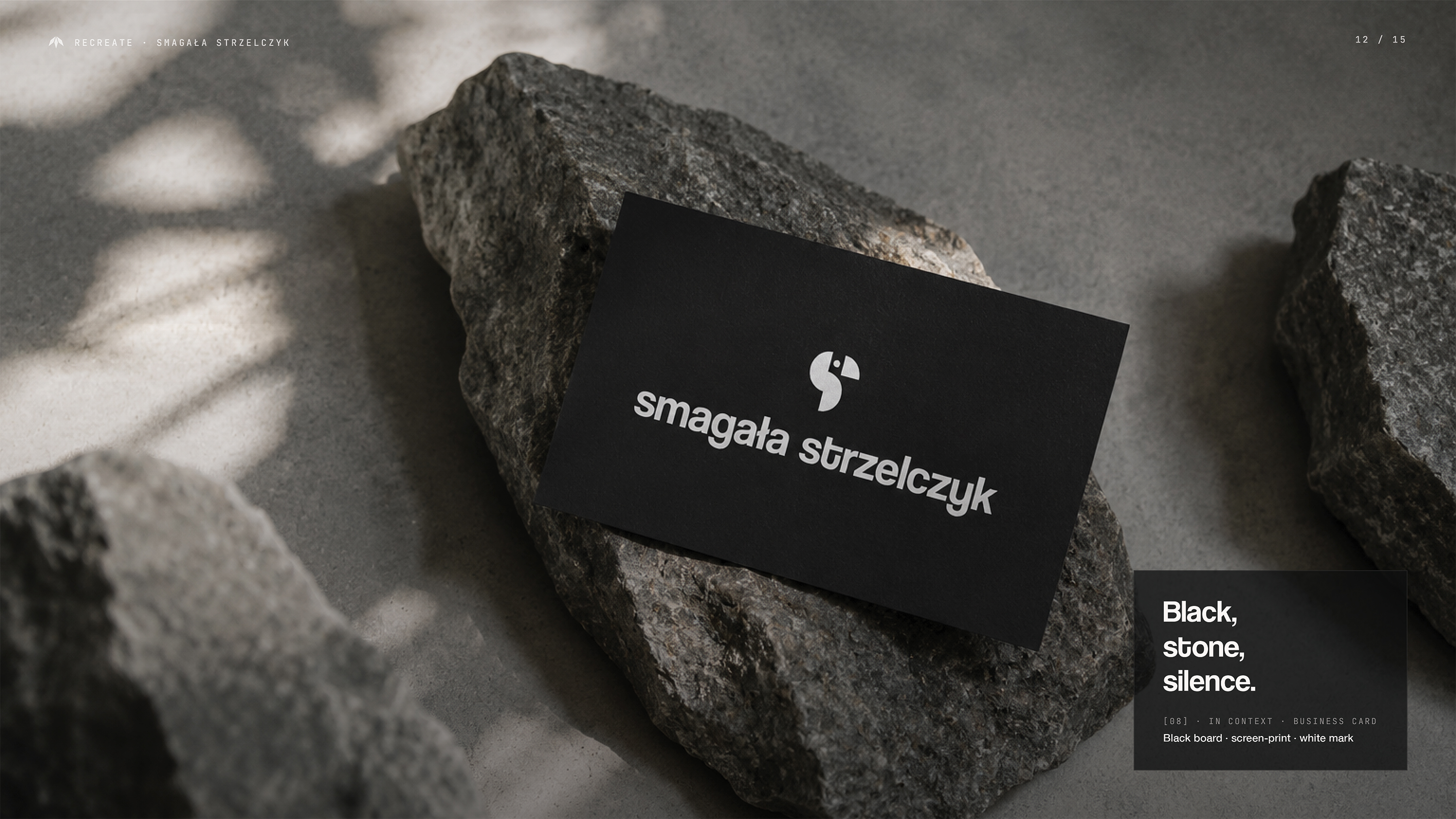
The logo reduces the parrot to a Bauhaus-inspired geometric form. A monochrome palette and clear typography give the identity a consistent structure across stationery, document layouts and signage. The limited visual vocabulary keeps the symbol central while allowing legal information to remain readable.
Development
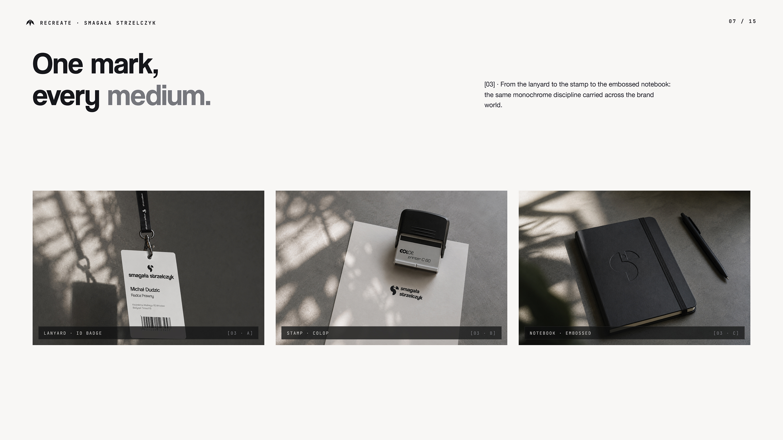
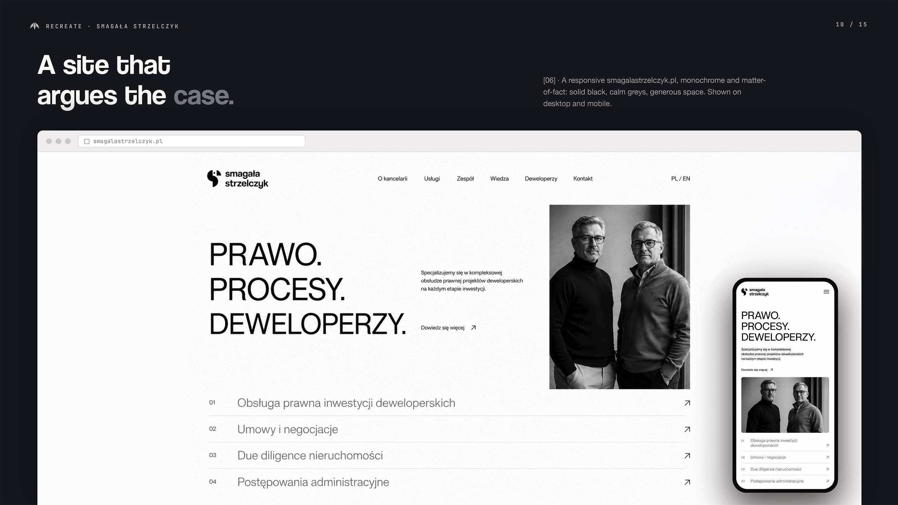
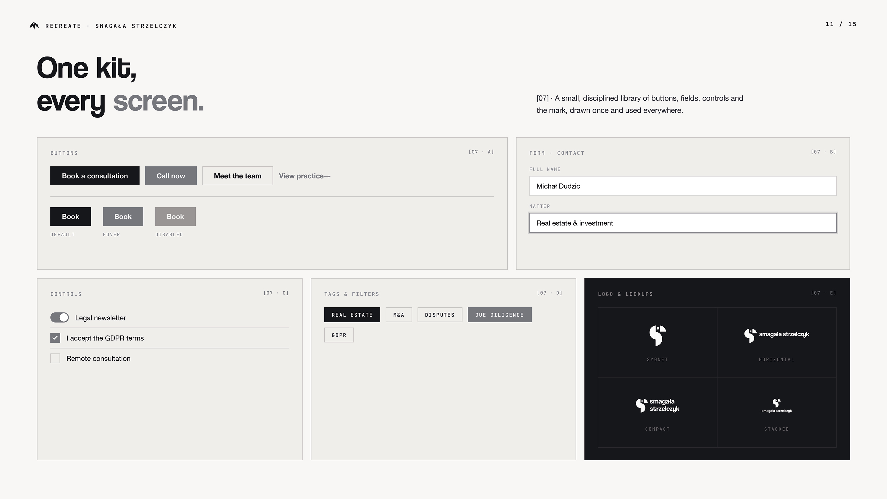
The identity was applied to printed documents, branded materials and exterior signage. A responsive website brings the same monochrome language to service information, team presentation and contact. Clear navigation and an enquiry form connect the firm's visual identity with a practical digital experience.
Next Project
MnaGotowo