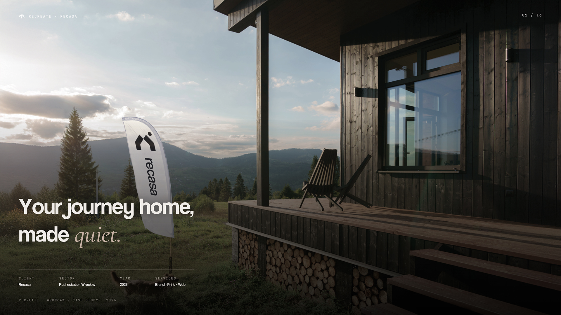
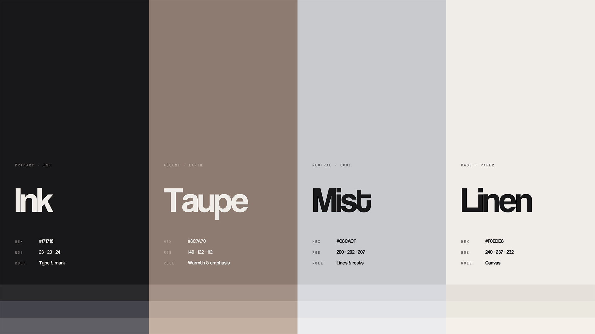
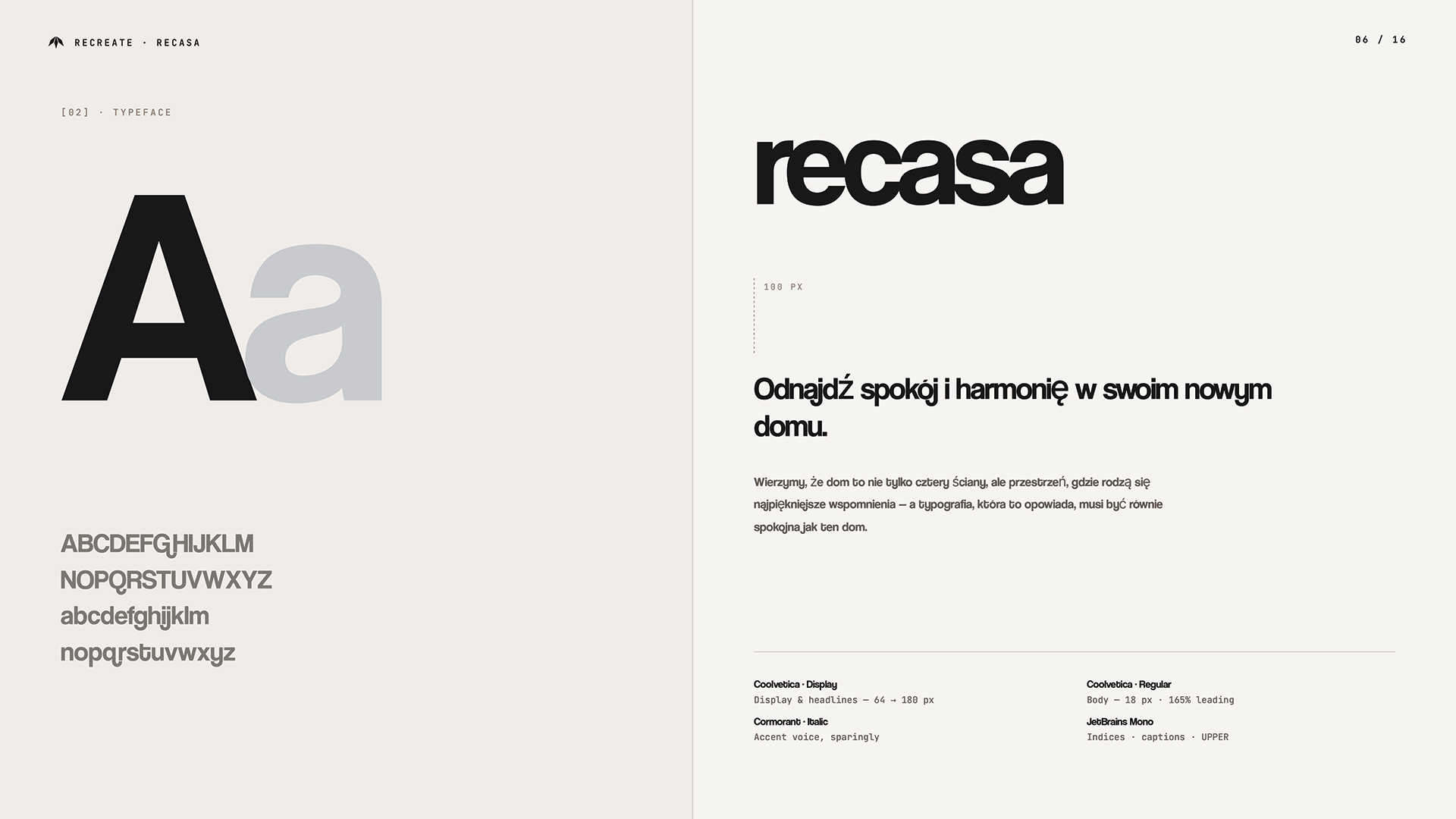
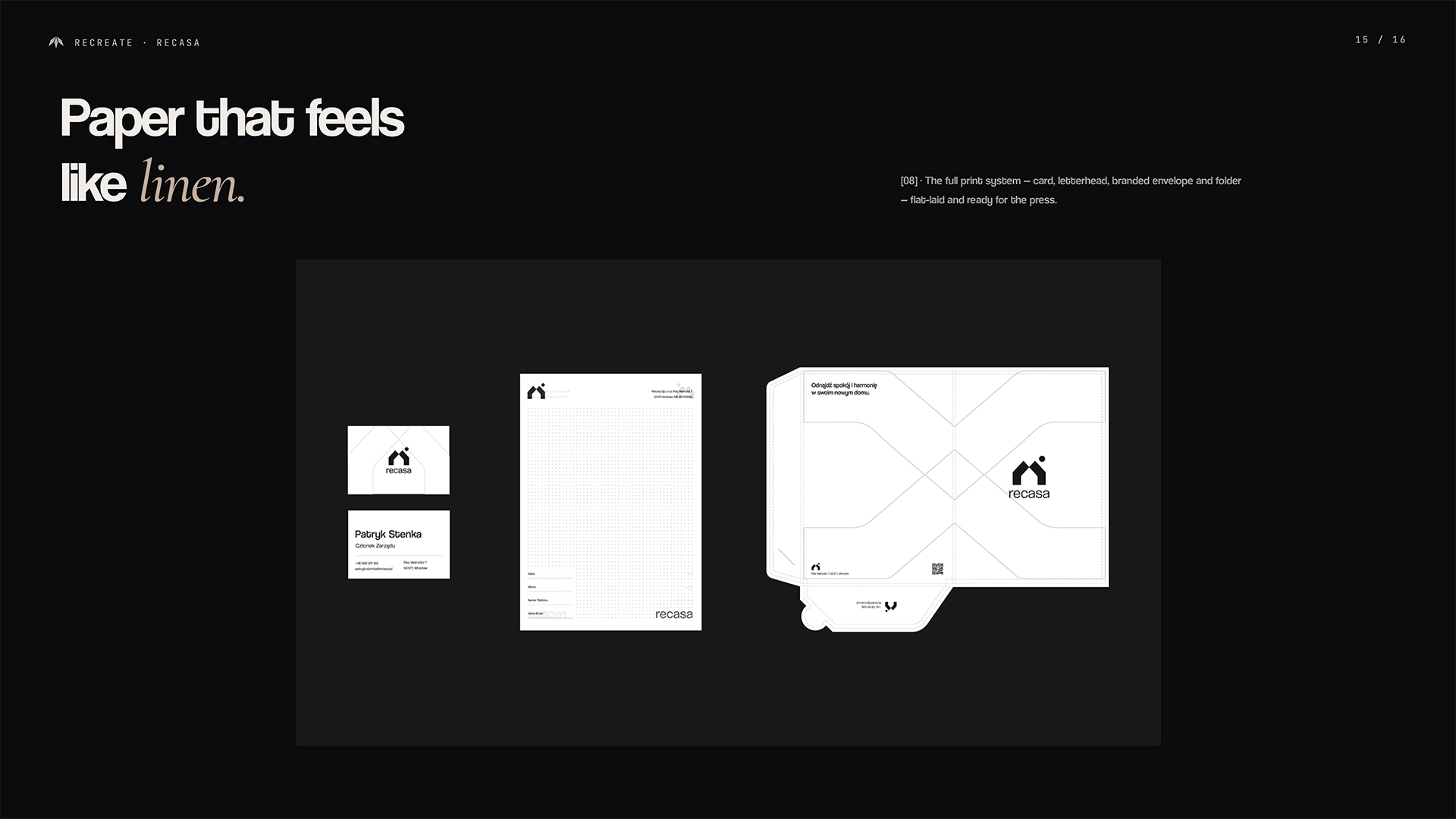
Recasa

A minimal identity for a real estate brand built on trust.
Client
Recasa
Year
2024
Category
Corporate Identity & Web Development
Research
Recasa is a real estate agency based in Wrocław, focused on sales and property consulting with a calm and personalized approach. In a market often filled with loud and impersonal messaging, the objective was to build a brand experience that feels refined, human, and trustworthy. The process began with understanding the emotional landscape of buying and selling property and positioning Recasa as a quiet, reliable partner throughout that journey.
Design
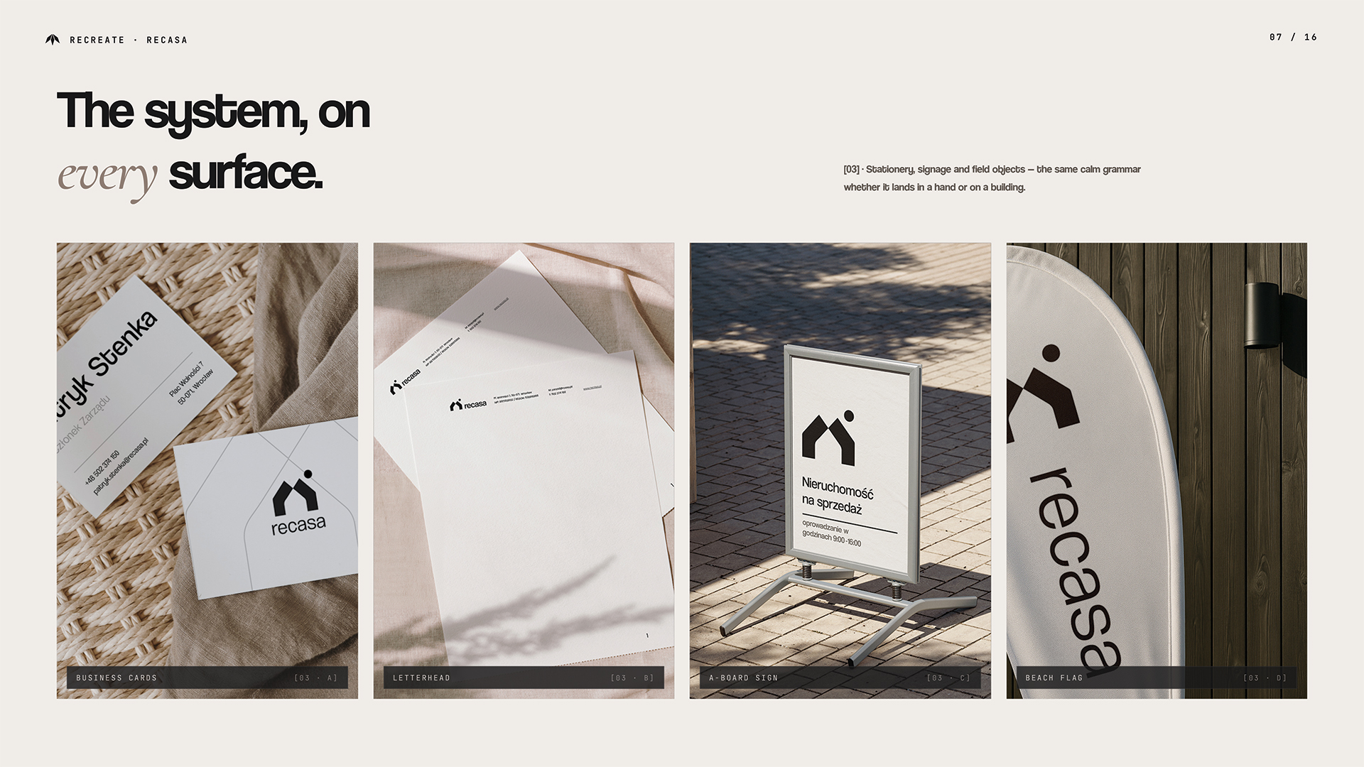
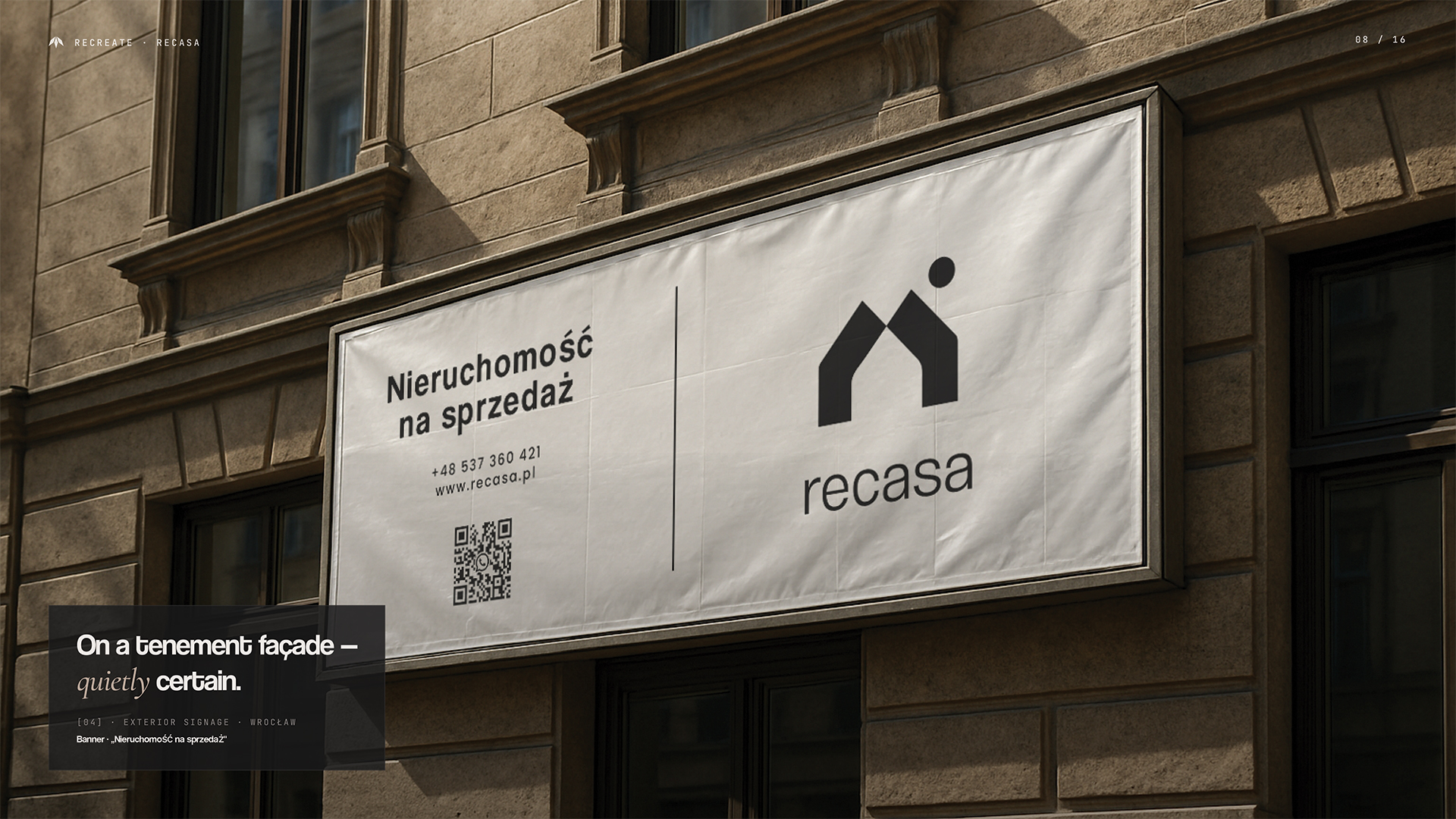
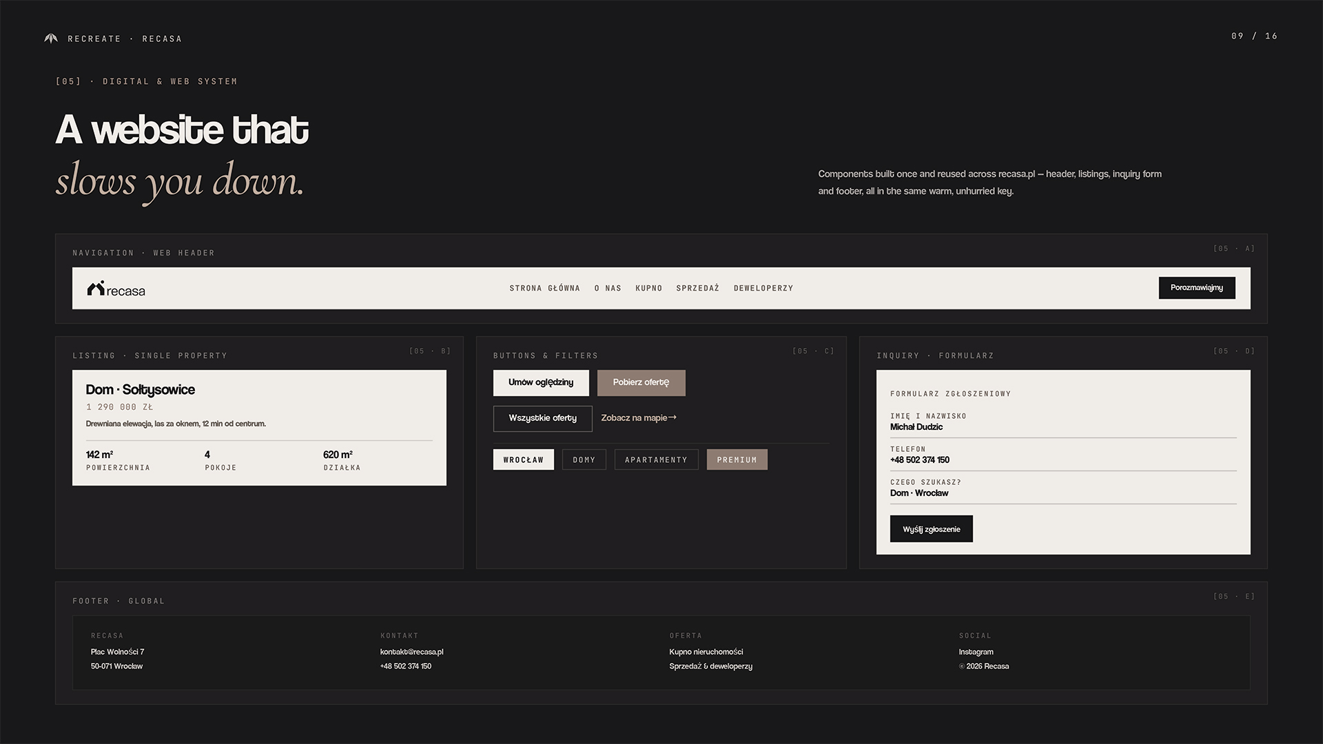
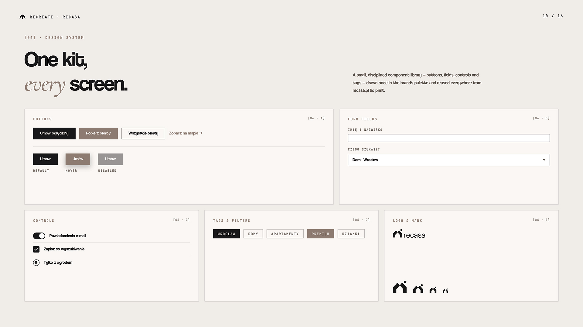
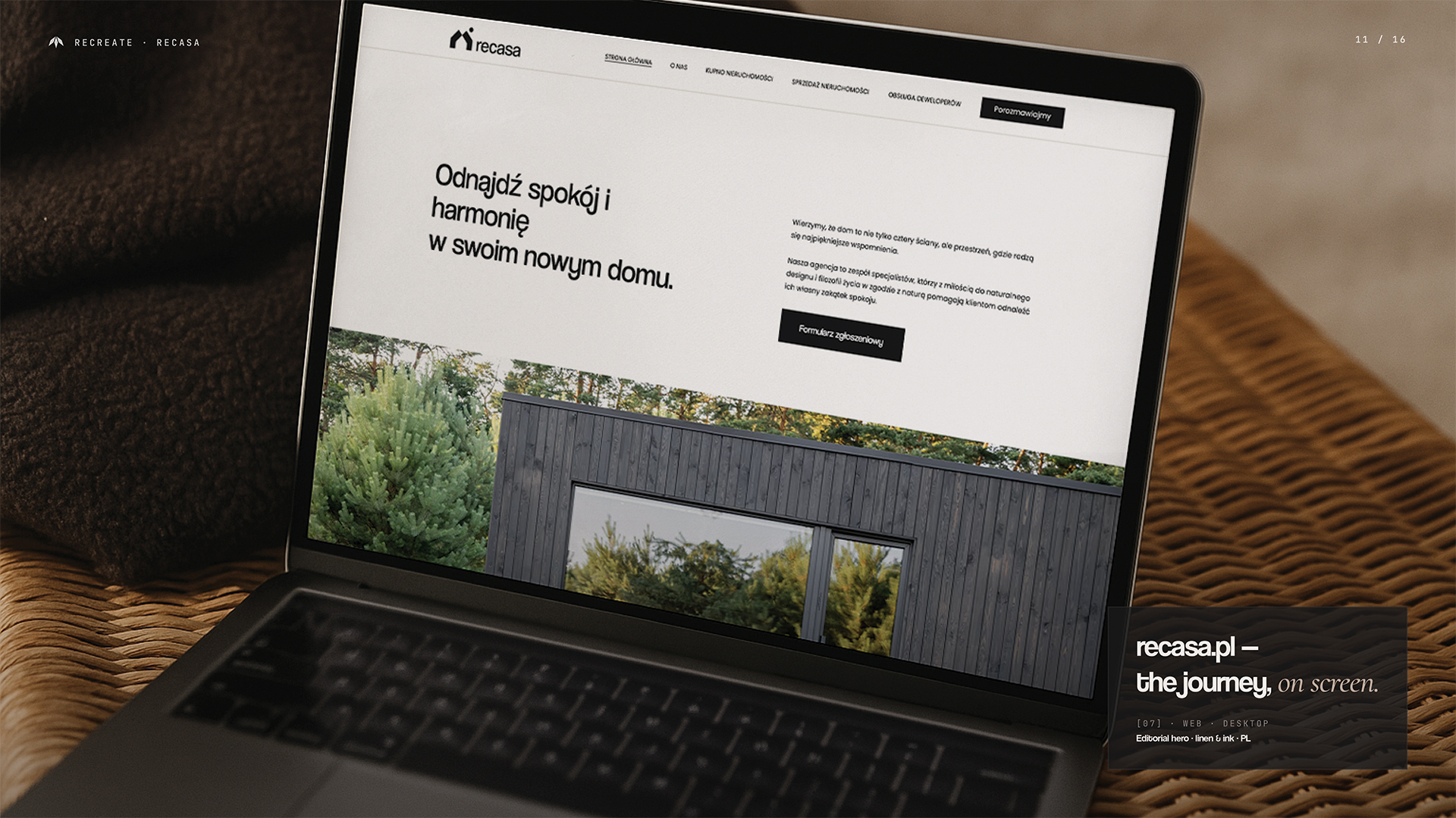
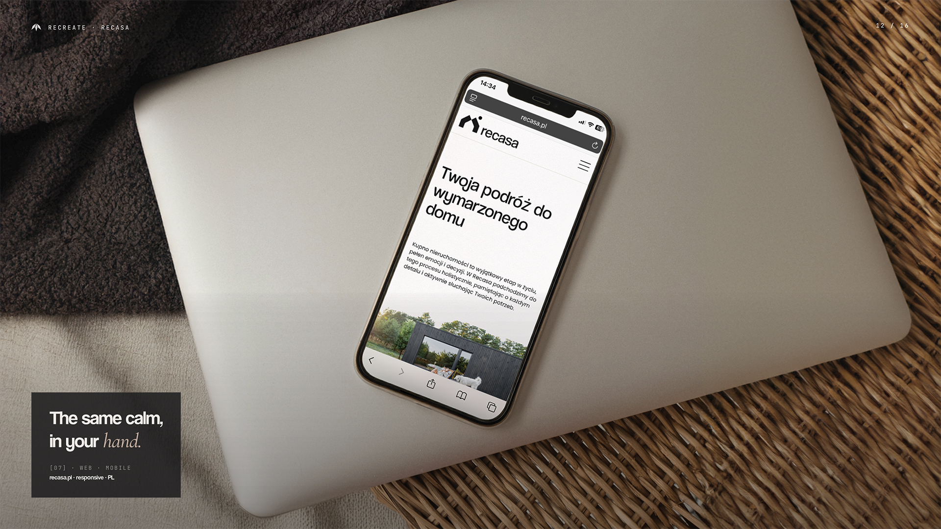
The identity was extended across all customer-facing materials such as stationery, digital templates, signage, and a custom-designed website. The site was structured to guide users intuitively while evoking a sense of calm and space. Every element, from paper to pixel, supports Recasa’s promise of thoughtful, professional real estate services.
Development
We created the entire brand system including the name, logo, typography, color palette, and tone of voice. The visual direction is rooted in simplicity and clarity. Natural colors, clean compositions, and warm yet structured typography reflect the brand's emphasis on peace of mind and quality service.
Next Project
Brzegostan