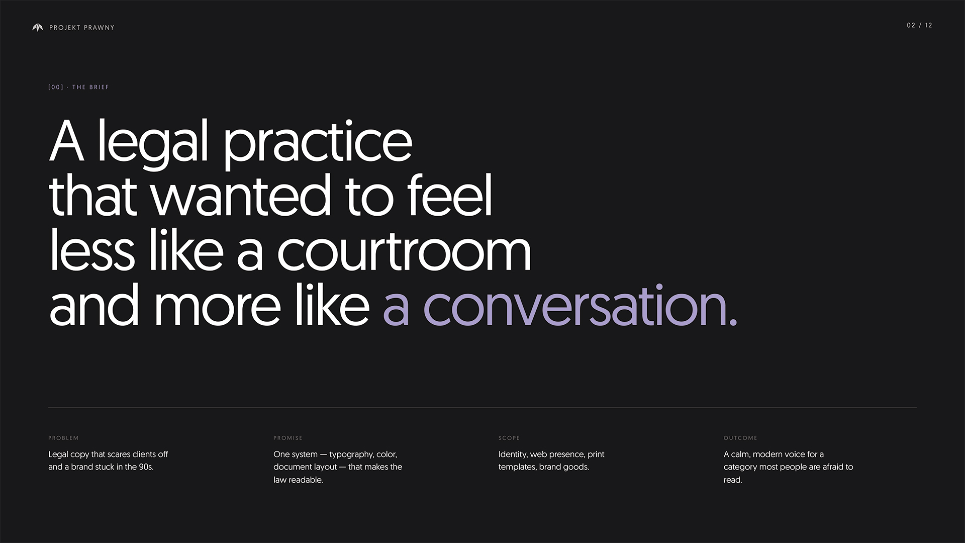
Projekt Prawny

Legal design with clarity at its core
Client
Projekt Prawny
Year
2024
Category
Corporate Identity & Web Development
Research
Projekt Prawny set out to reimagine how law is communicated—moving away from complexity and toward human understanding. Our research revealed a consistent gap: while legal content impacts everyone, its presentation often alienates. Through user interviews and brand analysis, we identified a need for visual and verbal clarity—without compromising trust or expertise.
Design
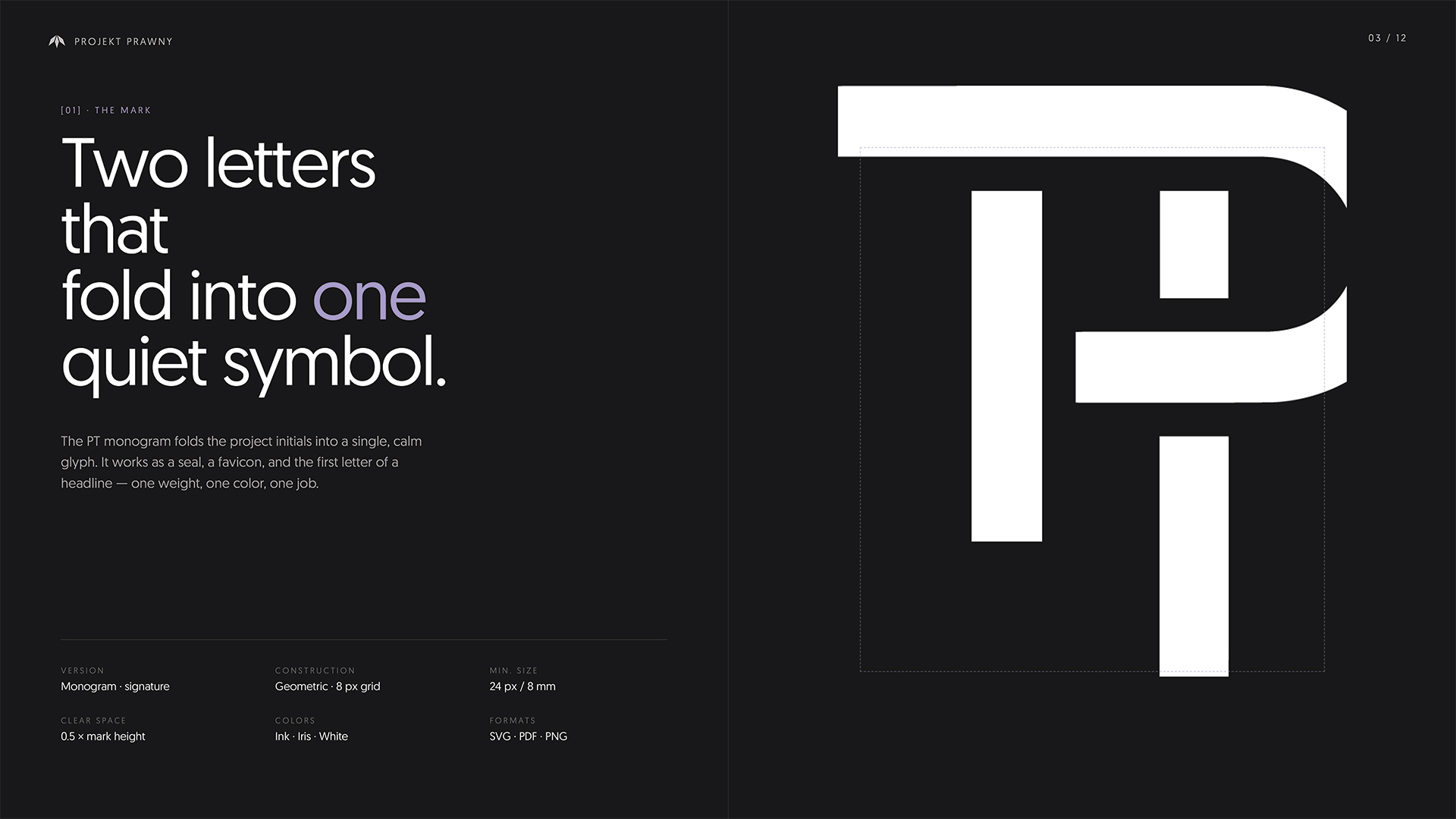
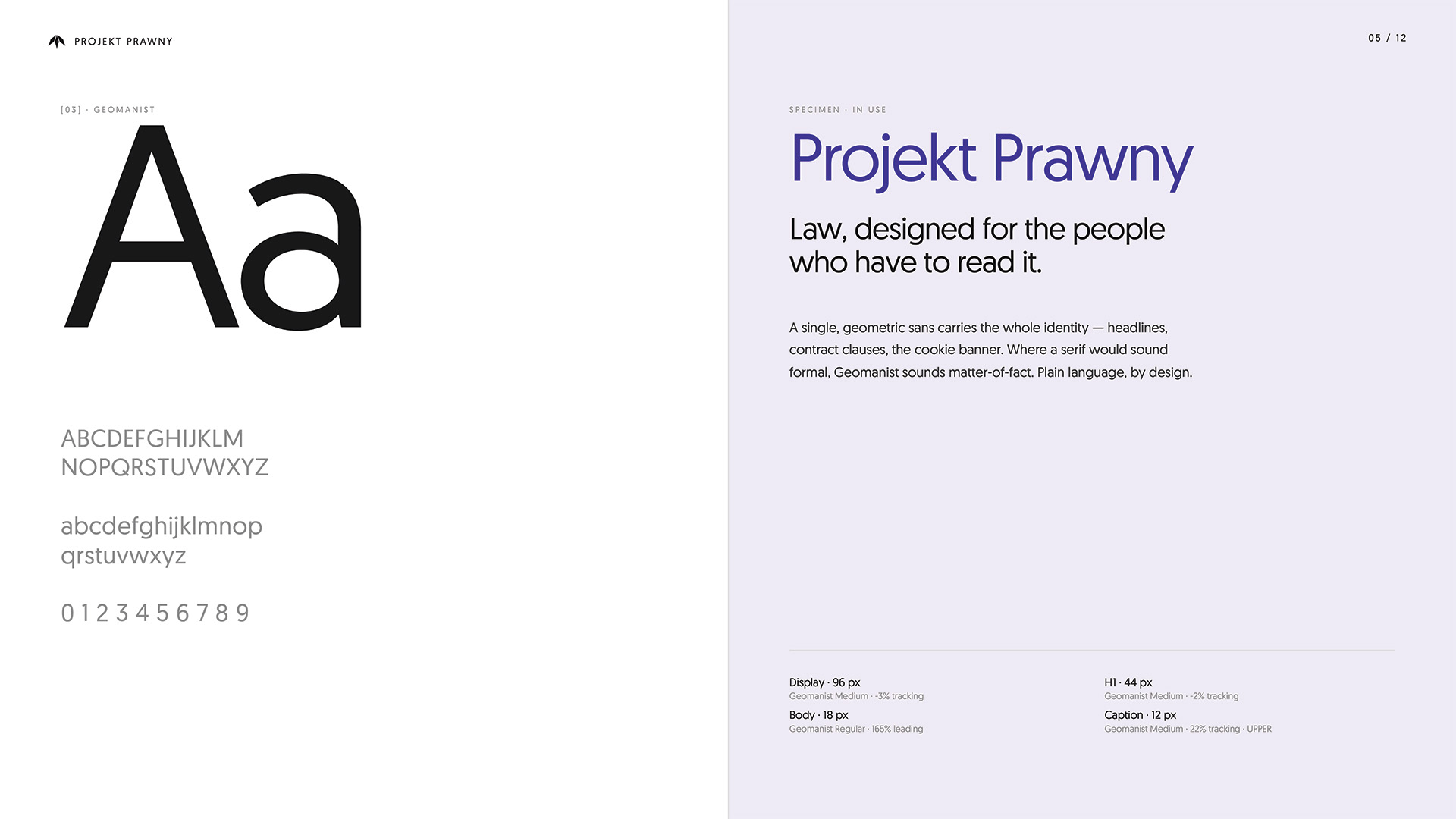
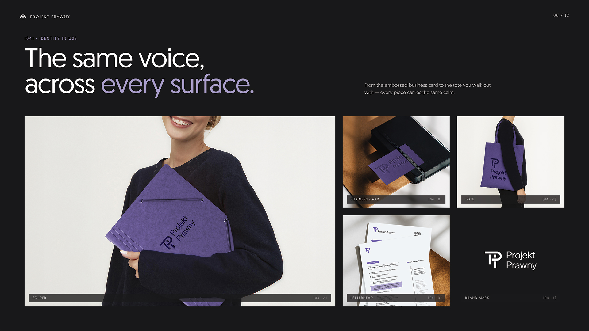
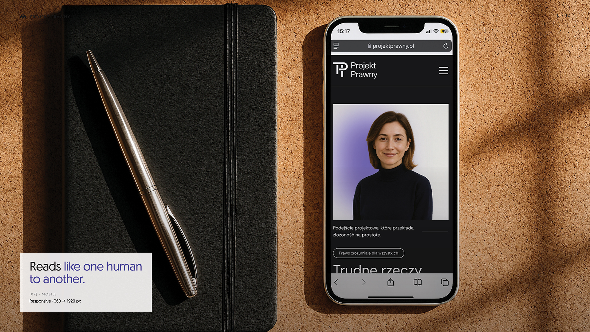
We created a visual identity rooted in structure and restraint. The 'PP' monogram is geometric and confident, reflecting the systematised nature of law. Violet anchors the palette, symbolising interpretation and reflection, while white and black ensure contrast and clarity. Typography and layout were designed for legibility—across documents, screens, and printed materials. Legal processes were reframed as visual guides, helping users move step-by-step through even the most complex topics. Every touchpoint, from embossed cards to structured PDFs, reinforces calm and control.
Development
We built a fully responsive website where law feels approachable. Content is structured, interactive, and paced with care. Offline, we developed editable legal templates and educational tools that translate dense regulations into functional, well-designed documents. Projekt Prawny proves that legal communication doesn’t have to be cold or confusing—it can be thoughtful, clear, and beautifully designed.
Next Project
Simple Accounting