Cyklostrada Dolnośląska

Brand identity, wayfinding and digital design for Cyklostrada Dolnośląska, the Lower Silesian cycling network. A clear graphic system connects route communication with website and app concepts.
Client
UMWD
Year
2024
Category
Brand Identity & Digital Design
White Cyklostrada Dolnośląska logo on a blurred green background with the tagline “A region on two wheels”.
Research
The direction considered everyday cyclists, families and visitors discovering the region. Route information and regional identity needed to work together across different contexts. Clarity, movement and accessibility became the guiding principles for the brand and its digital applications.
Design
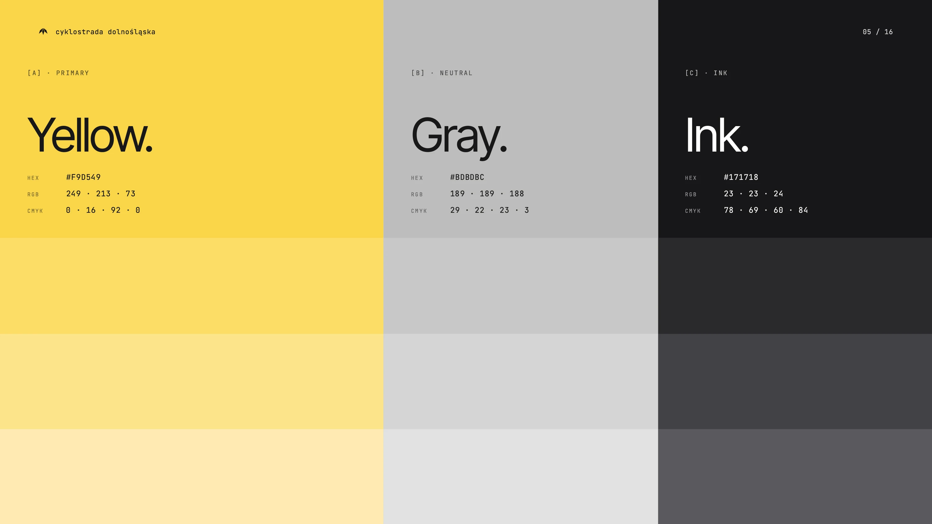
The logo combines references to a wing, bicycle frame and wheel. A yellow-and-black palette and Geomanist typography give the visual identity a consistent structure. The symbol and graphic system were designed for use across route markings, promotional materials and cycling equipment.
Development
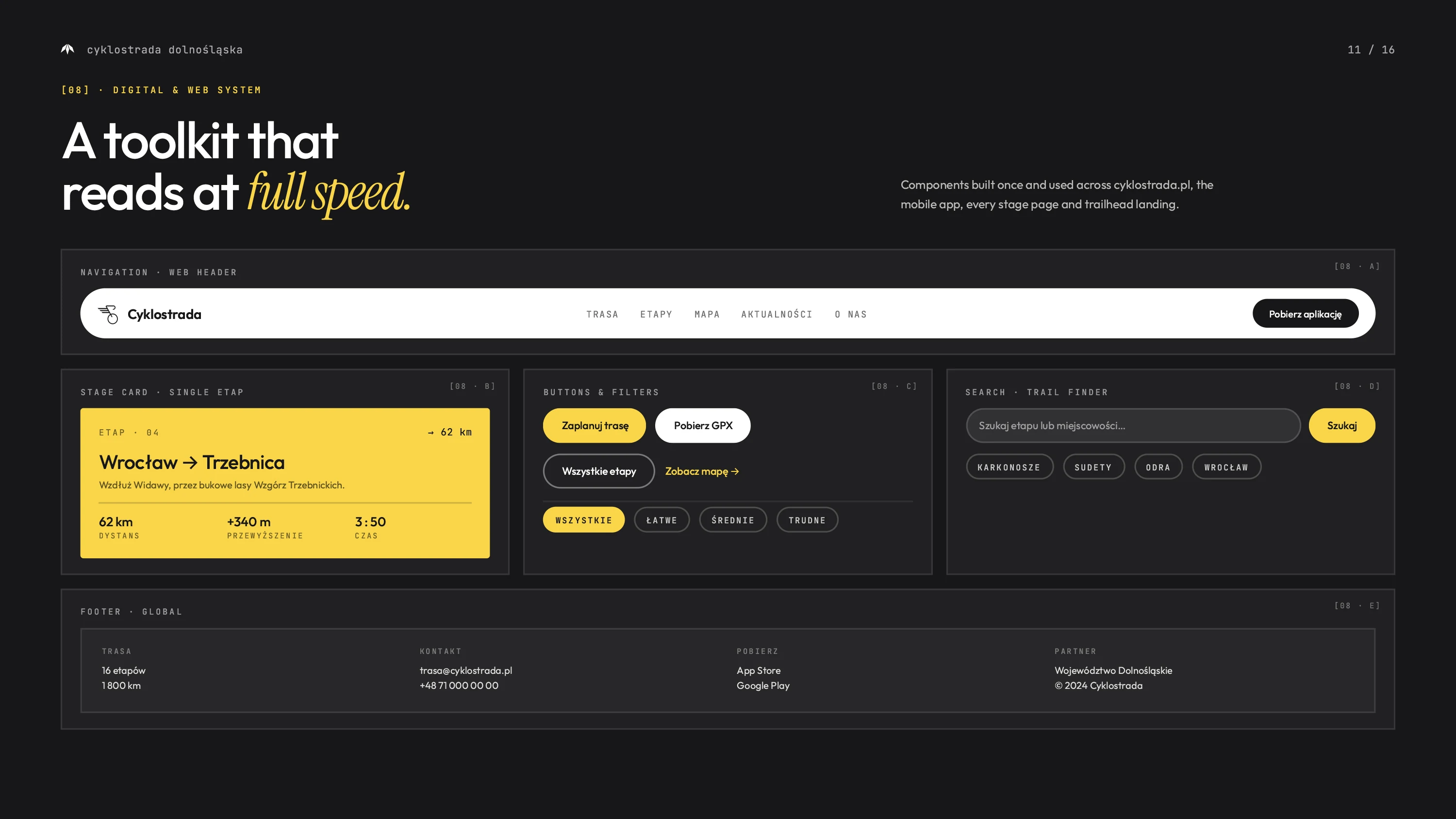
We developed brand guidelines and rollout materials for signage, posters, banners and branded equipment. Website and app interface designs extend the system into route discovery, ride planning and journey information. These digital concepts share the same visual language as the physical wayfinding applications.
Next Project
MnaGotowo