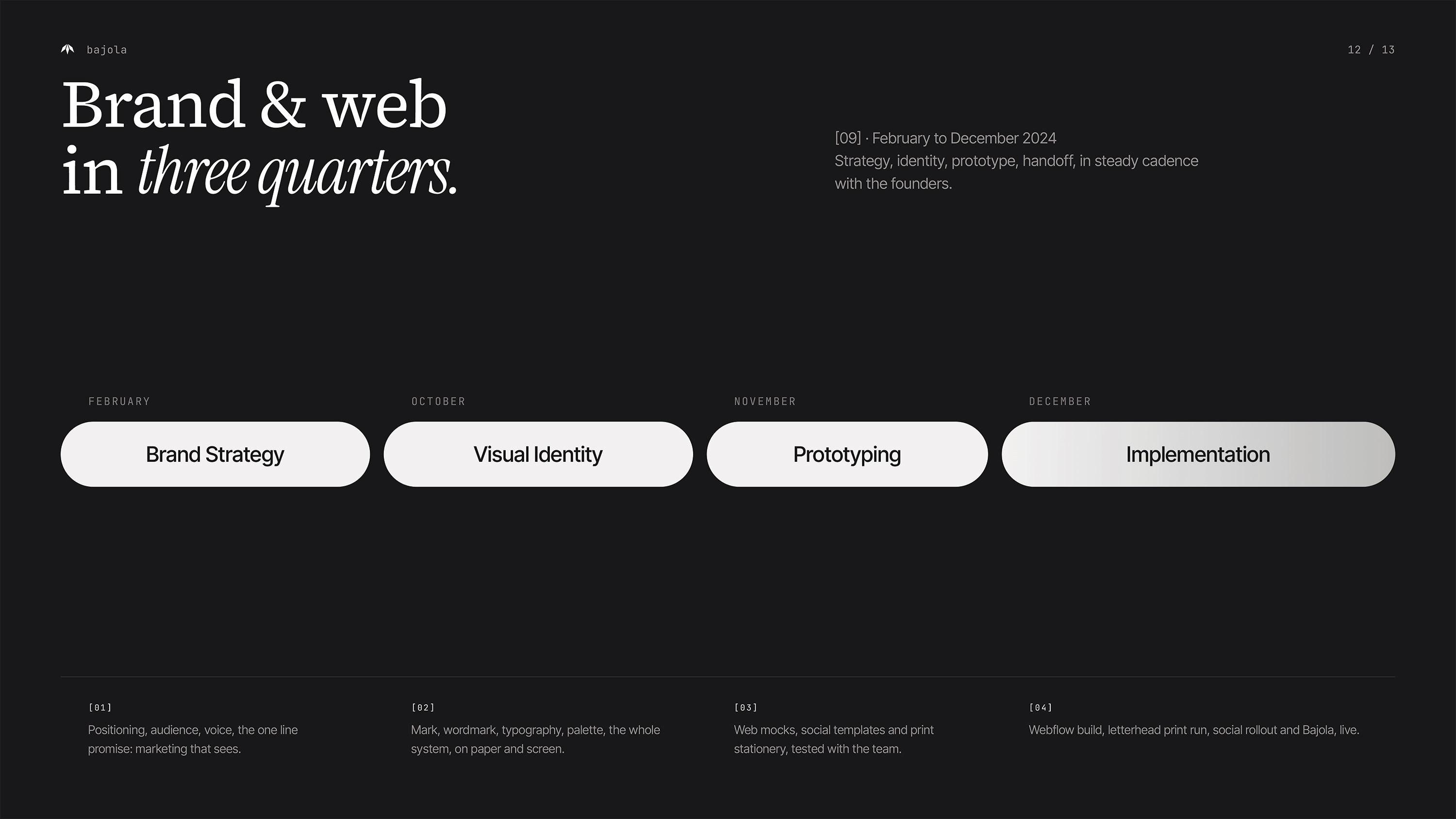
Bajola

Visual identity and website for Bajola — an external marketing team that works like it’s in-house.
Client
Bajola
Year
2024
Category
Corporate Identity & Web Development
Identyfikacja wizualna Bajola — logo z motywem oka na tle fal w kolorach lawendowym i koralowym. Branding dla agencji marketingowej, studio graficzne Recreate Wrocław
Research
Bajola was born from the need to connect strategy, creativity and execution in one agile, external team. During the research phase we explored what small and mid-sized brands need most — clarity, flexibility, and bold visibility — and translated that into a design direction full of energy and confidence.
Design
We created a visual identity rooted in contrast and memorability. The wavy orange lines reflect dynamism and flow, while the bold eye symbol represents intuition, insight and constant observation. The brand uses a vibrant palette and playful layout system, anchored by elegant typography to maintain balance between expressiveness and professionalism.
Development
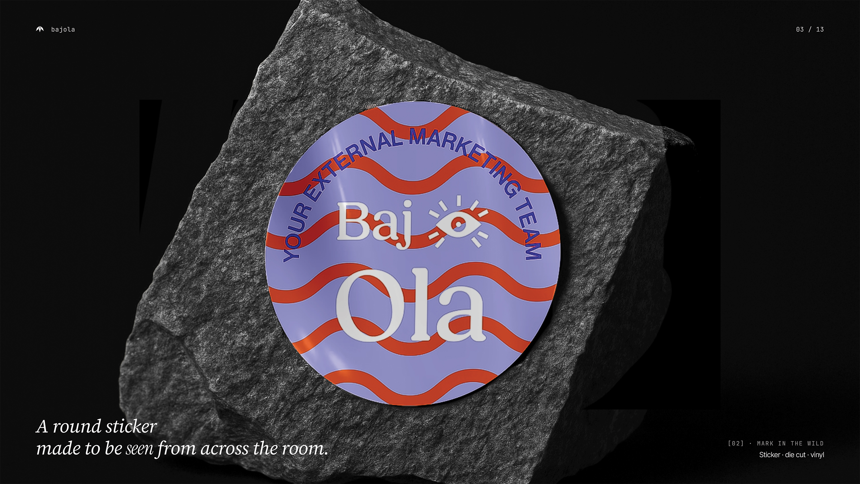
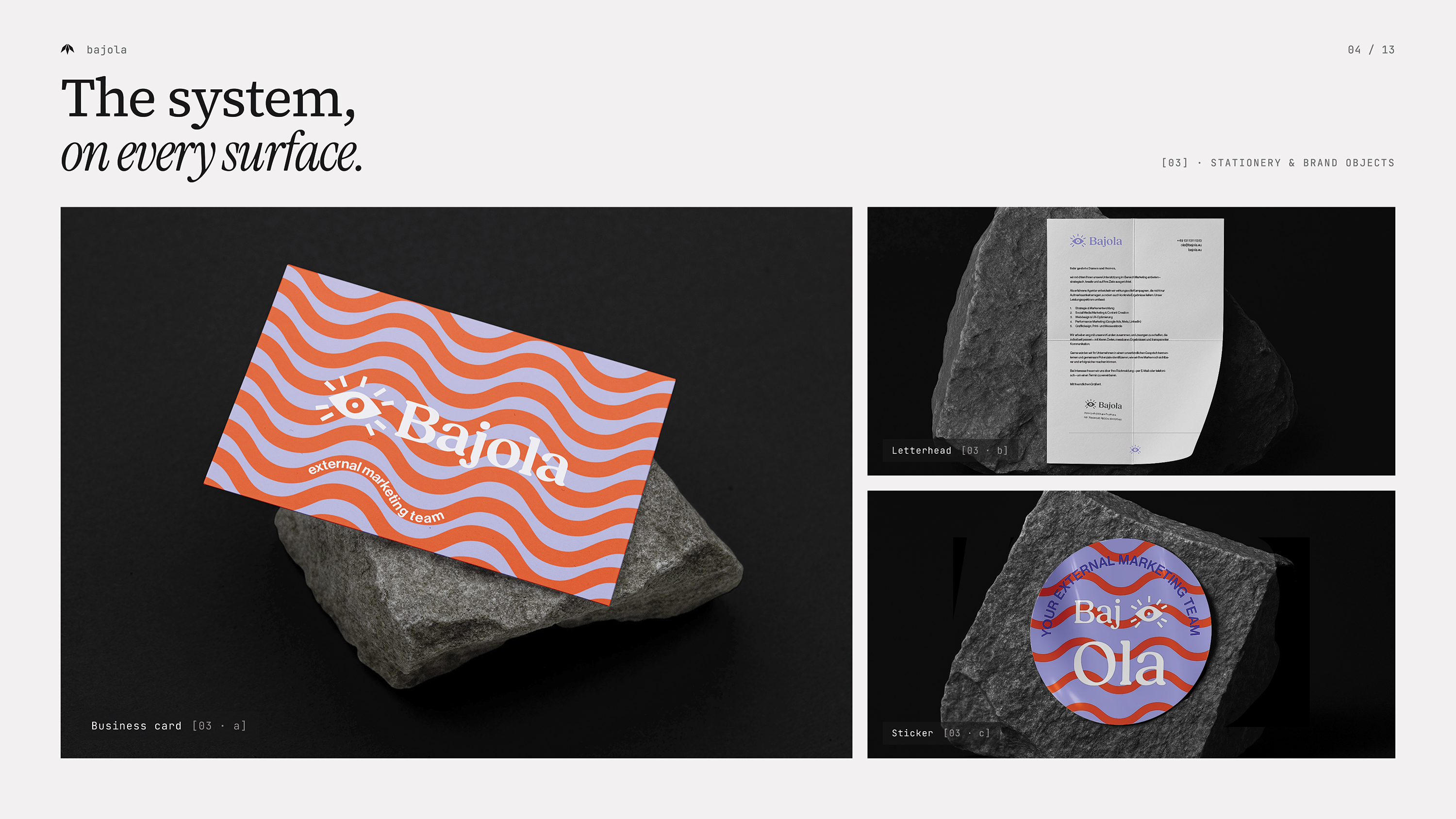
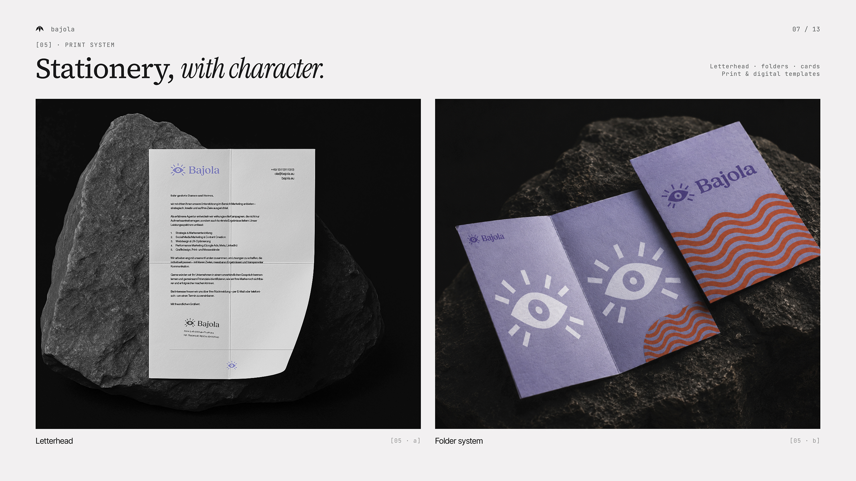
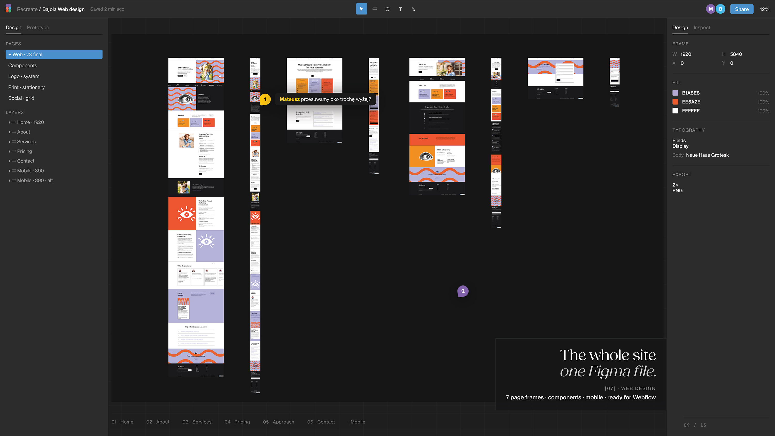
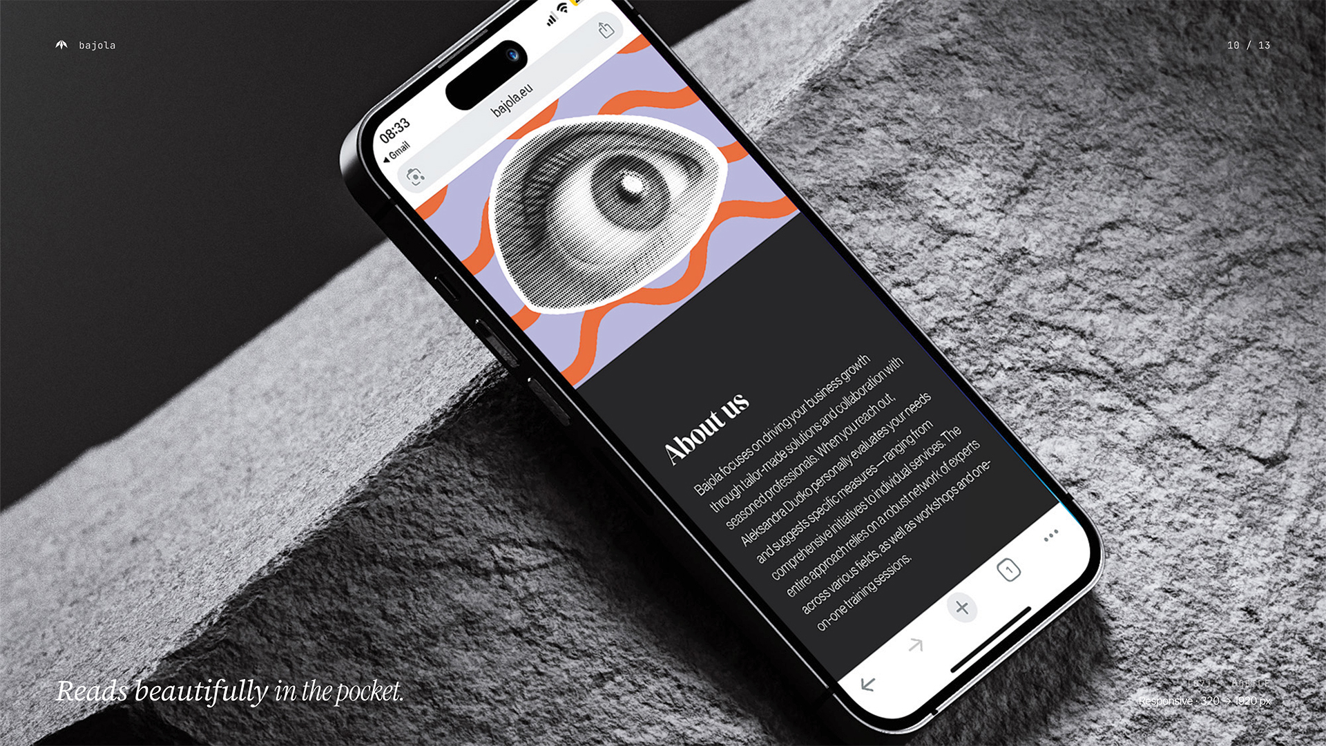
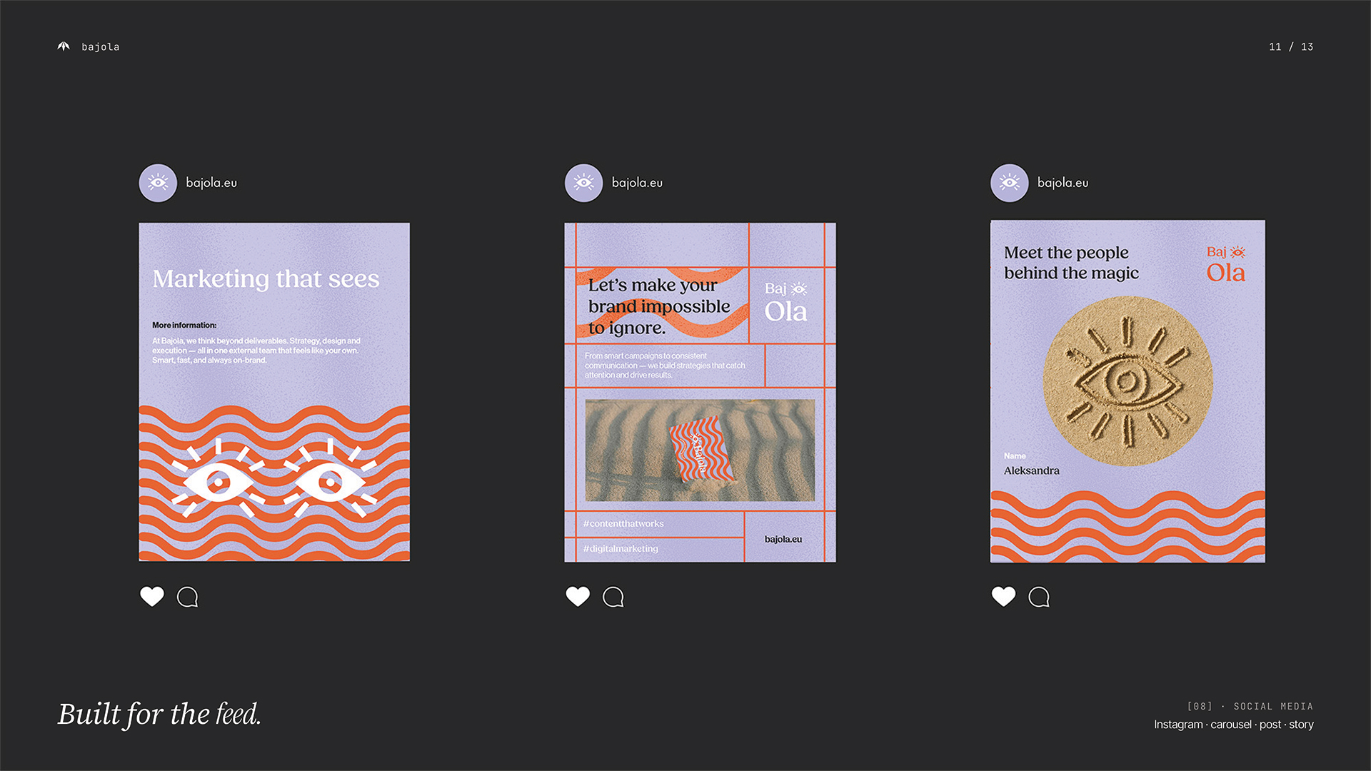
From digital to print, the Bajola identity system was designed to scale — business cards, pitch decks, social content, packaging, merchandise and a highly visual website built in Webflow. Each element brings the same clear message: we’re the marketing team that feels internal, even when we’re external. The result is a flexible and lively brand — built to turn heads, connect dots and grow businesses.
Next Project
3formy